
Tag: dashboards
-

Why We’re Swimming in Dashboards and Drowning in Data
Knowing how to use a dashboard is table stakes in the enterprise. Information technologies generate countless volumes of data from multiple sources, and dashboards are meant to harness all of that information, reduce the noise and display the stats you need to do your job. Yet businesses are still struggling to unlock the value of their data, with over half of global businesses (57%) claiming they can identify and capture just 70% of their data, according to a study conducted by IDC and commissioned by Qlik.
As in “The Rime of the Ancient Mariner,” there is water, water everywhere, but not a drop to drink. Enterprises are inundated with dashboards and still struggle to make effective decisions with the information in front of them.
The Limits of Analytics
There are many reasons why a dashboard may communicate ‘bad’ or ‘useless’ information. Analytics can’t do it all. A data pipeline may be parched with too little data or flush with the wrong kind of data, limiting the volume and/or value of outputs that can be drawn into the dashboard. The organization may be heavily siloed, rationing the range of information available to the dashboard. Or, the tooling itself might be inadequate for leaders to quickly respond to opportunities and disruption.
When a decision-maker looks at a dashboard, they want to see things as they could be, as well as how they are. That requires a dashboard that depicts the data itself, but that also generates views of, for example, how it looks when sales activity in the Southwest is increased in the face of a weather event or other externalities. Results don’t have to be taken at face value – they can be analyzed more carefully and intuitively to uncover meaningful insights.
Investigatory analysis is what modern, interactive dashboards and applications are all about. They support non-linear exploration and search and provide advanced features, such as augmented analytics, to help subject matter experts explore data and generate insights without relying on IT, data scientists or expert analysts. Interactive dashboards also make it possible for business intelligence to be truly self-service, simplifying aspects that were once limited to experts working in much more complex environments. They give all employees access to the insights they need to make better decisions, regardless of their skill level, essentially democratizing analysis across organizations.
How to Choose the Right Dashboard
For any business looking to really expand decision making across the business, here’s how to find a dashboard suited for investigatory analysis:
Accessibility and timeliness: In the past, business users who wanted insights had to submit a request to an analyst, wait for their turn in the queue and go back and forth answering clarifying questions before they could review a dashboard and make decisions. The process took too long, and insights came too late. With modern, interactive dashboards, users can explore all their data using interactive selections (filters), search, and NLP (natural language processing) powered by AI. In the end, they can ask and answer all their questions leading to informed decisions.
Flexibility: Modern dashboards are not just static displays of content with limited filtering. They are rich analytics applications that provide unmatched interactivity and exploratory power. Business users aren’t limited to rigid, linear analysis on partial subsets of data. Instead, they have the freedom to explore all their data however they like. Analytics are always in context together, giving users peripheral vision, and all data relationships are exposed – including what’s related to your selections and what’s not.
Performance: Interactivity should be driven by outcomes. Novel techniques to optimize and store data, index and understand relationships and deliver high-performance calculation all help to go beyond the limits of query-based and RDBMS architectures. Interactivity should also be enhanced with AI to deliver next-level analytical power, in new forms, across a full range of user experiences.
A Crucial Tool in the Stack
Turning data into business value is what a dashboard should—and can do—for the business. When a business user looks at a static dashboard or visualization, they usually end up with more questions than answers. To make an informed decision, they need to go through a process of questioning and evaluating – and then questioning again – an interactive display of business-critical trends until the right insight is fully uncovered. This iterative process is unique to every user and their lines of thinking, and modern dashboards allow all users, beyond data experts and analysts, to build visualizations and queries.
In addition to creating business value, interactive dashboards help rally key stakeholders in organizations and allow them to act quickly to changing market needs. Take, for example, a major luxury fashion retailer; parent company of three well-known apparel brands. Their businesses hinge on having the products consumers want and need, when they want and need them. Their assortment planners need to analyze their sales mix and inventory mix by product attribution to identify mismatches and, more importantly, understand the drivers behind the mismatches to make more accurate inventory recommendations. Interactive dashboards allow them to investigate their data in different ways and ultimately inform strategic decisions for the business moving forward.
In addition to empowering users to transform data into business value, dashboards ultimately drive the need for data literacy. Sharing dashboards throughout all levels of an organization fosters a data-driven culture by encouraging exploration of data – and that’s how new discoveries and innovations can be made.
So while some say the dashboard is dead, I say long live the interactive dashboard.
-

Embedded Analytics Essentials: A Checklist for Success
Integrating the analytics capabilities into your application can be easier than you think
Today, the ability to create and explore dashboards and reports, embedded directly into the apps your customers use every day, is no longer a luxury but a necessity to keep your product competitive and deliver value to users.
Embedded analytics brings many benefits for different groups. For end users, it’s a valuable tool to explore their data and discover new insights. For analysts, it’s an integral capability for advanced performance analysis. For product managers, it’s the best way to enrich and cultivate a data-driven experience for your customers with the latest analytical capabilities, built-in.
Moving away from decisions based on instinct toward decisions based on analytics and metrics delivered by centralized systems is one of the most impactful changes you can drive today. But for product managers in the business of delivering software or utilizing an application to drive customer interaction, the choices available for embedding analytics is a looming challenge.
This article covers the key challenges, scenarios and checklist considerations product managers need to tick off before implementing any type of embedded analytics solution.
Embedded Analytics: A Business Case for Buy vs. Build
Typically, the decision around embedded analytics boils down to build or buy.
Even with a need for fast technical integration and time-to-market pressures, many product teams first lean toward getting in-house developers to build embedded analytics into their app.
It’s an understandable first thought, given many have a specific vision for their app that a third-party might not ‘get’ immediately. But opting to build-in analytics more often than not leads to long-term challenges that aren’t always initially obvious.
The fact is creating an analytics platform from scratch is a complex task that takes years of work to create and refine. Aside from the advanced data expertise and technical integration required, having your developers focus on embedding analytics means they now have to:
- Face a very high investment cost to recruit the necessary skills for implementation.
- Provide all support, maintenance and upgrades for your homegrown BI functionality.
- Replicate the look and feel of your core application to ensure UX consistency.
- Match the analytical features of specialist BI solutions—a near impossible task.
With the time and skills needed to build your own analytics into your app from the ground up, you could face higher costs, increased risk and delayed time-to-market for your product—not to mention less time innovating and improving the core product experience for your users.
Your users ultimately expect to have data accessible to them for their day-to-day work. When they use your product, they will demand a certain level of reporting and analysis comparable to the BI tools they may already use in their own businesses at the moment—and yes, it will go beyond just having basic dashboards. If you don’t have confident answers for the most common questions required before building an embedded solution in-house—do you have the expertise, the manpower, time and knowledge—it’s not advised to pursue the build path.
So, what about buying an embedded analytics solution for your application?
What to Look for in an Embedded Analytics BI Solution
Buying an established embedded analytics solution often does away with many of the problems of building it.
You can shift away from home-grown reporting to a proven platform that can seamlessly integrate custom analytics into your app, amplify the reach of your product by engaging new and existing users with the latest analytical features, and even automate data discovery and analysis so you gain competitive advantage—though the last capability depends on the particular vendor.
However, buying comes with its own very important considerations that your product team and business as a whole need to evaluate and answer before making a decision. Below, we list the most important things to look for in both the embedded solution and the partner behind it.
Does it include everything I need to meet end-to-end operational reporting needs?
Your users will have a range of functional needs from the embedded analytics solution you buy, so the first thing you must answer is whether it can cater to their day-to-day work and provide access to advanced analytics. For instance, your customers want to know what to do next: Some might only need tabular reports (traditional), while others will demand richly visualized and interactive dashboards that drive action (modern). Eventually, some may look to use automation and AI in their analysis (augmented). The best options are those vendors that let you embed it all—dashboards, authoring, charts, collaboration, data preparation and modelling, admin and security. How each element is embedded (iFrames, JavaScript libraries with REST API calls) and where embedded code can run (cloud, desktop, mobile, web) is just as important to factor in, too. It’s not just about having dashboards in your app, but ensuring you have future-proof capability that continuously scales with your users as their data needs grow.
Can the solution be embedded seamlessly?
It’s not just all about having the best and latest features. A cohesive, seamless user experience between the analytics portion of your product and the core software itself is a big part of delivering an exceptional product, so when choosing to embed analytics, ensure the solution allows your team to have exceptional control to make it look like a part of your app rather than like one different app hosting another. Many modern embedded solutions allow you to white-label; this is recommended to allow for consistent design across your platform, as you will eliminate your users’ potential concerns around security, performance or support with using another product.
Can it help me ensure faster time to market?
A common problem with creating an embedded analytics solution in-house is the investment in time and money it takes to get your product to market with the new capabilities. It’s also difficult to ensure the integration process can be done as quickly and efficiently as desired. The embedded tool you buy should accelerate that process and significantly reduce the development cycle, so your team is able to begin using your new analytics within days instead of weeks and your devs stay focused on improving your product’s core value instead of configuring reports.
Next Steps
Selecting an embedded analytics product can be a difficult task, but so long as you keep your product and analytics objectives aligned and follow best practices checklists, integrating the latest analysis capabilities into your application is not as far-off a future as you may think.
-

Logi Analytics Simplifies Dashboard Development
Logi Analytics launched a tool that promises to make it easier to design, build and embed interactive dashboards and data visualization within applications.
Company CEO Steven Schneider said Logi Composer helps ease the task of creating data visualizations within the context of a DevOps workflow.
Based on technology Logi Analytics gained via its acquisition of Zoomdata last year, Logi Composer enables DevOps teams to create interactive self-service dashboards for end users as part of a microservices architecture based on Docker containers, he said.

To help achieve that goal, Logi Composer includes support for a range of Smart Data Connectors constructed as a set of microservices to access databases and other things.
Schneider said as applications evolve developers increasingly are being required to embed business intelligence (BI) functionality within their application. However, he noted, most end users don’t want to move data into a separate BI application to analyze trends when they could be surfaced more easily within an application they are already using.
The challenge has been finding a way to provide developers with a set of tools for building self-service visualizations in a modular fashion that makes them easier to build, maintain and update, he said.
Of course, developers have been adding visualizations to applications for years. But most of those visualizations don’t let end users interrogate data—users now expect to be able to manipulate visualizations with a modern application at a much deeper level, said Schneider.
A recent market study published by Dresner Advisory Services finds 62% of respondents consider self-service BI to be either “critical” or “very important.” A separate report published by Allied Market Research estimates the market for embedded analytics will generate revenues in excess of $60 billion by 2023.
Data visualization is a critical aspect of every digital business transformation initiative. As organizations look to digitize more processes in the wake of the COVID-19 pandemic, the need for more robust data visualization capabilities within applications has become more acute. Most end users are unable to make sense of massive amounts of data without the aid of visualization tools.
It’s unclear to what impact embedding BI capabilities within applications will have on standalone BI applications. There may always be analysts who want to pull data from multiple application sources to analyze trends. However, the bulk of users are likely to have their BI requirements met within an application that includes connectors to pull in external data when required. Applications that don’t include data visualization capabilities are not likely to be widely employed by users.
Ultimately, embedded data visualization will reduce reliance on both spreadsheets and standalone BI applications. However, like most substantial changes to end user behavior, it may be a while before that cultural shift takes hold.
In the meantime, DevOps teams should expect to see a lot more analytics functionality being embedded within applications. The challenge now is finding a way to streamline the development and deployment of those modules within the context of a larger application development project.
-

Quality Culture, DevOps Forge Better Connections Between IT, Lines of Business
The automation of software development does not obviate the need for a collaboration between IT and the lines of business, or the development of a culture of quality on the part of the development team. Achieving that quality culture requires more than a change in mindset as developers seek to align quality with the speed and automation goals of DevOps.
There are five items required for a quality-driven DevOps environment:
- Understanding the proper role of “minimum viable product”
- Collaboration between IT and lines of business
- Having metrics in place
- Across-the-board buy-in
“Quality culture is characterized by employees who are motivated to consistently strive for the highest level of quality,” said Al Riles, principal consultant at Tunnell Consulting, a firm providing solutions to the complex problems faced by life sciences and biopharma companies. “That’s one key component of it, as well as the ongoing process of continuous improvement.”
Minimum Viable Product and Continuous Quality
Aligning quality with the speed and automation goals of DevOps is critical to success, and part of this is gaining a deeper understanding of the role of “minimum viable product” and understanding when that approach contributes to the development process.
“The concept of ‘minimum viable product’ does not, as its name would suggest, contribute to a substandard product,” said C.R. Venkatesh, CEO of Dot Com Infoway, a CMMI Level 3 IT company. “Quite the contrary, the concept is the basis of continuous and iterative improvement, and encourages the use of user feedback, which often results in insights that might be missed by the in-house team.”
The concept of quality culture and MVP are not mutually exclusive in a DevOps environment, so long as continuous improvement is part of the equation.
Collaboration Between IT and Lines of Business
The collaboration that is a key part of DevOps is also a key part of quality culture. “You have a culture in place where everyone embraces that fabric that includes the right type of behaviors and the right values, including communication, reward and recognition, as well as clarity on roles and responsibilities,” said Riles. “That working fabric gets well-defined, because everyone is functioning around the same key elements that constitute that strong corporate culture.”
“Collaboration has always been important in a DevOps environment,” said Venkatesh. “But we need to define precisely where that collaboration exists. In an internal environment, that collaboration is between IT and lines of business. Increasingly though, IT and development is an outsourced function, and in such cases, that collaboration must be preserved. What this means is that it exists not just within the confines of the outsourcing provider, but also between the provider and the client. The developer must seek out alliances not only with the client’s sourcing manager, but also with other internal stakeholders in the project.”
If You Don’t Measure, it Doesn’t Exist
Quality initiatives require an active role in changing the mindset of all stakeholders, but mindset alone won’t get the job done. Metrics must be in place and tied to those quality initiatives. “Even in the smallest of development projects, defined quality metrics must be set ahead of time, with clearly defined outcomes,” said Venkatesh. “By asking what we hope to accomplish with a development project, clearly defining the goals and adhering to a set of predefined quality standards, developers—whether in-house or third-party—are able to accurately predict what the outcome will be.”
Riles’ process involves a quality management maturity grid, which identifies multiple dashboards. “It allows the organization to become familiar with what a quality organization consists of, and then you can use this maturity grid to measure where the organization is once you embrace this initiative. Then, you can implement the initiative, and come back and re-evaluate yourself to see the progress you’ve made,” said Riles.
Everybody Has a Seat at the Table
Incentivizing all stakeholders, throughout every level of the company, is paramount and, according to Riles, “It has to do with communicating what the vision is, and having a clear quality message that’s coming from leadership. Then, there has to be a shared quality mindset among all staff.” Riles notes that the quality mindset is shared by everyone in terms of understanding the organization’s objectives, policies and procedures and their roles in hoping to achieve them.
This is reinforced by leadership at all levels, who are actively engaged in supporting the development of a quality culture, and they engage and motivate others to do the same. For it to be sustainable, we realize that success is based on the sum of all parts of the organization. They must be continuously monitored and fine-tuned as the organization grows, and this includes communication, reward and recognition, and engagement.
About the Author / Dan Blacharski
 Dan Blacharski is a thought leader, advisor, industry observer and PR counsel to several Internet startups, and author of the book “Born in the Cloud Marketing: Transformative Strategies for the Next Generation of Cloud-Based Businesses.” He has been widely published on diverse subjects relating to cloud computing and technology, and he is editor of BoozeHub.com. He lives in South Bend, Indiana with his wife Charoenkwan and their Boston Terrier, Ling Ba.
 -

DevOps Storytime: The Line, The Loop and The Cube
In a time not so long ago, but long enough to be before the mainstreaming of magical ideas such as “configuration as code” or “platform as a service (PaaS),” in a period where the enterprise IT shops were ruled by the one-two punch of Six Sigma and ITIL, there were three magical artifacts sought by the people who spent their working days lubricating the gears of the consulting, development and operations factories throughout the lands of corporatedom.
The three mystical objects consisted of The Line, The Loop and The Cube. Each were first envisioned as possibilities by “automation zealots” as they roamed the corporate cubicle farms in vain attempts to provide enlightenment to their enterprise brethren. As the quest to drive evermore efficacy out of technology shops of all shapes and sizes has progressed, strategists, designers, architects and developers have been slowly creating these possibilities into being. Much like the legend of the Deathly Hallows, if these once-mythical objects come fully into being, the enterprise that can behold all three of the artifacts can create the nigh invincible product/technology factory as it becomes the master of time.
Continuous Integration – The Line
In conceptual land, The Line was just what it sounds like: a singular line, never bending and never deviating from its course. It connected the space from development to production. The idea of The Line has been around a long time—long enough for many shops to now have working implementations running as standard operating procedure. But it wasn’t always this way.
 In reality land, The Line was a patchwork of open-source frameworks, glue code, xml files and a few engineers unlucky enough to be tagged with role of “Build Master.” Woven together by the Build Master, these transformative robots and would take coders’ output, compile it into a workable build that merges all of the developed functionality, run and validate test harnesses against it. Once validated, the newly minted build then would be promoted to the higher-level environment, ultimately moving from dev to test, test to stage and, lastly, from stage to prod.
The tools to build and manage The Line have been through many iterations since it first came into use and many shops have progressed far enough into the advanced territories of The Line to call themselves masters of the once-mythical Line. The shops exploiting The Line are now so prolific and the tools have advanced enough that it’s no longer an onerous task to get change-resistant enterprises to try it out.
The Line has transformed from mythical artifact to concrete reality so much so that the believers now outnumber the holdouts. The end result is that shops not embracing the basics of continuous integration risk losing credibility in the eyes of their staff and any potential recruits.
OODA is a Way of Being – The Loop
When someone starts talking about “getting the right information to the right person at the right time,” that person is talking in fairly vague terms about the the long sought-after grail of The Loop. The Line is a good start, but the robot watching the line is only as smart as the humans who created and configured it. This is one of the many reasons to chase The Loop.
What is the use in “shifting left” if you can’t get the alerts and metrics to the people who care? How can the metrics from “shifting left” be acted upon if they can’t be pushed into the view of those who can act upon them? The Loop is the answer, because it is the mechanism to determine many things beyond “the right person.” The Loop knows how to get messages to all interested and responsible parties. The Loop has mechanisms to account for an ever-fluid organizational structure and backup delivery methods for backup delivery methods.
All enterprises have feedback loops. The key differentiator for moving toward mastery of The Loop is the degree to which you have automated the and abstracted the mechanisms inside the feedback loops.
Many people and enterprises are resigned to life without The Loop. The signs are easy to see if you know where and how to look. Are mail distribution lists and org charts always a pain in your organization? Are executive-led fire drills the norm when systems are down? Are system alerts dropping on the floor rather than getting to the first responders and application owners?
If you answered yes to any of the above, your enterprise has not committed to developing and leveraging The Loop. Basic “loop-like” alerting functionality is commonly available from alerting vendors, but true mastery of The Loop cannot be achieved without robust identity management and synchronization technology. Without this critical integration point, alerts and information flow can only be as effective as your manual processes that update the myriad data islands in each and every alerting system within your enterprise.
When enterprises grow, being able to have the enterprise robot army seamlessly drive information flow without requiring sieve-like manual processes is also the key to tightening the enterprise OODA (observe, orient, decide and act) loop. Done with full mastery, one could imagine the possibility of acquiring the last of the three magical grails and maybe the most sought after: The Cube.
Perceiving the Matrix – The Cube
The story of The Cube begins with a question: “What defines the so-called ‘right’ information?” When enterprise technology and design evangelists talk of The Cube they often wax poetic and describe it as all things to all enterprise people at every level within the organization. It provides not only the integrated matrix of the fully faceted enterprise from an organization perspective, but also extends beyond operational information rights into decision rights, affinity groupings and cross-functional teams.
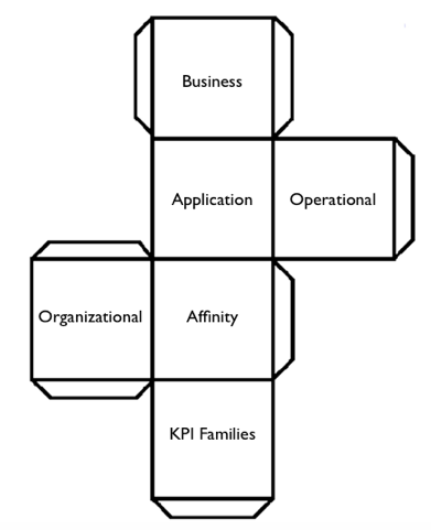 We have begun to see promising beginnings of The Cube pop up within medium and large enterprises through popularizing algorithms and outfitting teams with ubiquitous mission control-style dashboards and screens in team areas. But it is only when these dashboards can integrate and harmonize wide varieties of development, operational and business KPI data that we will be able to claim that we have delivered full and timely context (i.e., “the Right Information”) to the staff sailing the enterprise ship.
The hard part of creating The Cube is not so much the technology required to achieve its development and integration. The really difficult part is coaxing the organizational will to define and maintain the KPI taxonomies for each organizational unit and the integration points between them. Given that a fully mastered Loop doesn’t necessarily understand how KPIs, infrastructure and applications interrelate and affect each other, the Loop will forever be but a required stepping stone to The Cube.
Will a Unicorn be Required for Unification?
The current landscape of open-source and vendor tools to wield and tie together these ungainly enterprise models may not, as of yet, be sophisticated enough to both integrate and simplify the provisioning and cultivation of The Lines, The Loops and The Cubes. The sultry, siren-like call of the Unicorns, however, will likely beckon the cloud builders of today and tomorrow to create not just development to deployment pipelines, but also fully integrated feedback loops with intelligent understanding for how the data connects to form perspective.
It is odd to think about, because with the idealized future state so close to actual possibility, it begs a new set of questions. Hordes of IT professionals around the world have been working to find faster and more fool-proof ways to deliver meaningful perspective into the hands of decision makers and first responders. We are so close now to that mission being accomplished that there are a few instances of the perspective itself not only being generated by “the robot” but also being handed to “the robot” to take the necessary remediation steps.
The ending we are approaching, much like the beginning, circles around a question: “If we truly automate all the things, will there be any more work to do?”
-
Dashboards from Hell
Even organizations with a mature DevOps services model inevitably will hear from executive sponsors about the “need” for a dashboard for DevOps information. Organizations just starting to embrace DevOps won’t have the time to construct one yet, but over time will reach the same conclusion. The need is real, and the value is significant—it is how you get there that makes the difference. Vendors are keen to promote the idea that they already have a dashboard built into their respective products. And this is partially true.
But the problem with dashboards is not a matter of information, it is a matter of perspective and scope. Ultimately, all of the information an audience wants can be found in the various DevOps tooling used in the continuum of services your organization created. However, locating some of it takes profound knowledge of how each tool operates, adequate security profiles and an elephant’s memory as you click on multiple windows to try to correlate the data you ultimately are seeking across the various tools.
Before you know it, executives and perhaps even practitioners are calling for a consolidated dashboard that would present this information cleanly. The danger here, of course, is an attempt to consolidate every perspective from every individual audience into a single dashboard for your company. Instead, it is wiser to begin such an effort by breaking down the number of audiences into categories (by need, perhaps) and examining what is already available and what is missing to make a dashboard project effective, and not one originating from hell.
Dashboards: The Practitioner Perspective
There is a keen difference in what a typical engineer wants to see as it relates to DevOps from what the other audiences will be looking for: namely, detail. If you consider this part of a dashboard effort the foundational section (i.e. providing the right detail information to the engineers who ask), the remaining higher-level presentations can be built on top of this data. Most engineers are content to just “look into the given tool” to get what they want. But sometimes consolidating this information into a dashboard begins to make more sense.
Ideally, your company has only one build tool and, again ideally, only one deploy tool. If you have multiple types of both kinds of tooling in these disciplines, you would be better served to pick a winner there than try to use a dashboard effort to consolidate build and deployment data across multiple build and deployment tools. Allowing multiple kinds of build and deployment tools across an enterprise usually winds up in the demand for multiple dashboards from multiple audiences, and before you know it, the dashboard project from Hades once again has infested your organization. A clear winner in build, deployment and release orchestration cuts out this kind of problem.
Most of the time the need for a dashboard emerges when users are trying to see information in a way the native tooling did not plan for. For example, I want to look at a given server, or class of servers, and a list of everything that is on them (by version). Or as an example, I want to look at these technology components of this type and version and find out every server in my entire data center that they may have been deployed to.
Some vendors offer internal reporting capability intended to meet these needs. However, using those reporting features should be labeled with “caveat emptor” signage. Typically, vendors apply their reporting directly against online or production data within their respective tools. So an engineer presses the report button on his build tool, and the build reporting function begins to look at its own data from a production viewpoint, instead of from an offline reporting copy of the data. When you start running reports against “live” tools, you get slowdowns, sometimes significant slowdowns.
To avoid this issue, start with determining what data the engineers need, how often they need it and to where you can copy this information (to form the basis of your dashboard system). You also may wish to examine how the base data is inherently constructed and join some of it where it makes sense, so you are not issuing very large queries joining key data from many tiny tables together before anything sensible emerges for your new dashboard system. Speed of presentation will matter still, even though the data becomes only near-real-time instead of real-time.
Dashboards: The Business Perspective
Once you have ascertained the detailed information to satisfy your engineering or practitioner community, it usually needs to be married to your business segmentation to meet the needs of this audience perspective. For example, I may have 30 servers that I use regularly in my e-commerce products or line of business division. My engineers may care less about this designation, as they only care which servers are content servers or database servers or application servers. But my e-commerce business teams look at this information differently. They only want to see “their” servers, not every server in my company. So to accommodate the next perspective audience, I need a way to marry servers and technologies to the product lines or lines of business my company understands.
This may require an outside or additional database that tracks the raw server name and marries it with the business unit that cares about it. It may also track the application names the same ways, marrying them with the appropriate business unit. But this marriage now offers the ability to pull reports (or dashboard screens) by line of business—it is nearly certain your basic build and deploy tools weren’t designed to show information in this way. This kind of business segmentation, or filtering (in some tools), provides an entirely new way to examine the data. The need to drill down to the details may still exist, but a picture of change relative to a product line or business line becomes a high value-add for the business community who looks at DevOps data.
The business community looks at DevOps information to help it make decisions based on the state of change at any point in time. E-commerce customers, for example, might get special company notifications of upcoming changes or improvements in their capabilities, as the business community is made aware, and stays current with the planned release events and quality of testing underway. Or those same notifications might be delayed based on a quick look at the same information presented the same way.
The point is, business users are an important community or audience of DevOps information, and the lens they use to examine data is from a product or line of business construct rather than the raw data aggregated by a practitioner.
Dashboards: The Executive Perspective
Executives, no matter the level, usually are more concerned about trends in the information than point-in-time data. For example, a given executive may want to know how many deployments per month are happening out of the development class environment for a given line of business. If you have constructed your dashboard with the architecture laid out above, you should be able to provide this kind of information. The discreet data is stored offline (copied from the build and deploy and other DevOps tools themselves), then married with the business segmentation data. Now it can be presented in trend-over-time manners that executives invariably want.
It is much more likely that a business team member will use the drill-down features of your dashboard than your typical exec. But having it available up to the executive layer is a huge win when demonstrating the detail of what is going on where and potentially framing the why. The other significant win of having a single dashboard for presenting trending data is the consistency in the presentation across the enterprise. Consider for a moment how many Excel spreadsheets are sure to spring up around the company when execs task their people to produce reports that aren’t available in a dashboard at their fingertips. Each minion of the exec likely will grasp certain data in unique ways, often resulting in bar charts that never seem to line up.
Having one dashboard—or, rather, one method of presentation of the same data—eliminates having multiple unique minion versions that lack context and often misrepresent the real story. In addition, without having a central dashboard you construct and control, minions will pull data requests against the production copies of build and deploy and release tooling, perhaps slowing these tools down to a crawl while data is gathered. The act of looking at a thing will certainly change the speed of that thing, in this instance.
Impact to the Bottom Line
Meeting the 80/20 needs of your primary audiences of DevOps data can be done without tying up programming resources forever. Once you have delivered a core dashboard system with mainline capabilities, your executive or business teams can decide how much more resources they are willing to fund to continue to update and enhance the dashboard. As long as they fund it, you can dedicate the resources you need to keep making it better (see agile). But for most shops, this kind of dashboard is a three-to-six-month effort from end to end.
Once the dashboard is up and running, it becomes “the” tool in the arsenal of transparency for DevOps services. Granting access to this kind of tool (i.e., setting up user IDs) is significantly simpler than doing it in the multiple of underlying tools you have to administer without it. The cost of administration in a large firm can be substantial if a dashboard is not present. Imagine having to set up a typical user ID in your build tool, deploy tool, configuration management database, testing tool(s), release orchestration tool and monitoring tool—and that’s just to start. Within these types of tools that provide a real service or function are secondary concerns such as security or permission profiles, group memberships, etc. A dashboard only needs a valid company ID, and you are ready to “see” change in motion via DevOps.
The work effort typical executives “task” their minions to produce reports is usually no small effort, either. While this work effort is rarely captured or understood by the executives who request it, it definitively puts a drain on company resources (both man and machine). A functional dashboard can eliminate this work nearly altogether, and produce a consistent work-product output. Your DevOps strategies should be created to reduce costs and facilitate innovation at every turn. If you need help feel free to contact me, I am still looking at the moment 🙂 .
To continue the conversation, feel free to contact me.
-

Top 10 IT Management Tools
Staying up with the latest IT management tools is akin to keeping up on the latest Starbucks drink options. We simplify it here through a look at the most useful tools, from monitoring to DevOps orchestration and APM.
IT management tools have entered a new heyday, thanks to the advent of cloud, DevOps and mobile computing. With all of the new types of infrastructure, software and development methods, developers and IT managers need simple automation to get through the day. But with hundreds of IT management and DevOps tools on the marketplace today, both open source and commercial, it’s hard to know where to start.
The global DevOps tools market alone is expected to be worth $3 billion by 2019, according to Technavio. While there are many applications to choose from, we have compiled a list of our favorites below. Some of these are tried and true, while others are newfangled and still in their early days of experimentation.
Microsoft System Center Operations Manager (SCOM)
IT Operations Management and IT Service Management
Microsoft SCOM is a legacy enterprise infrastructure monitoring and management tool that delivers comprehensive coverage for the Microsoft ecosystem of assets and devices, whether they are installed on internal data centers or in the cloud. SCOM has evolved over the years to monitor network and storage along with Unix-based systems.
Cautions: Since SCOM is a deep monitoring tool that collects data from many different systems, it generates a large volume of data and alerts that can overwhelm systems administrators and IT managers.
Vistara
IT Operations Management and IT Service Management
Vistara is a comprehensive tool for monitoring heterogeneous multivendor assets and devices, whether installed on-premise or in the cloud. It covers a wide swath of Microsoft and Unix applications and systems, major enterprise vendors such as Oracle and Symantec, and top storage and networking technologies. Vistara also integrates well with other monitoring tools. A unique feature of Vistara is that it records all user sessions, which provides an audit trail for tracing system changes and other events.
Cautions: Vistara is a powerful, multifunctional tool and needs to be set up properly to derive the maximum benefits.
SolarWinds
Network Monitoring
SolarWinds is a leading tool for managing and monitoring performance of a multivendor distributed network environment. The tool delivers a lot of useful metrics, including performance, capacity and downtime. It is particularly useful in companies with many locations, such as a retail brand, or a national or multinational company with a large number of branch offices and locations.
Cautions: SolarWinds does not provide comprehensive monitoring for servers or storage systems.
(Editor’s Note: SolarWinds reached out to devopsy.kinsta.cloud to clarify that it does offer comprehensive monitoring for servers and storage systems through its Server & Application Monitor and Storage Resource Monitor tools.)
Nimsoft (CA)
Network Monitoring
Nimsoft is another excellent network monitoring tool, but is best-suited for an on-premise (internal data center) environment that has standardized on a few types of equipment and has a low rate of change. A company that is adding new technologies and devices frequently won’t find the tool to be flexible enough to adapt to evolving needs.
Cautions: This legacy tool is not ideal for diverse and fast-changing IT environments.
ServiceNow
IT Service Management
ServiceNow is well-known in the industry for comprehensive service management, including service level management, financial management, incident management, availability management, change and release management and more. ServiceNow has the broadest coverage for all ITIL activities, making it the de facto standard for service management and suitable for use in small companies up to the enterprise.
Cautions: Because this tool is so flexible, you can easily customize it to meet your organization’s specific needs. Beware that by doing so, you’ll need a full-time administrator to manage the customized system.
Chef/Puppet
DevOps Automation and Management
When it comes to tools for managing cloud application development and deployment, Chef and Puppet have near-cult status among developers. Companies occasionally use them both, but there is overlap between the tools. Chef is ideal for DevOps provisioning, orchestration and configuration management and is a more flexible platform overall, featuring auto rollback to previous versions. Chef also provides real-time visibility into metrics and messages. Puppet is best for DevOps automation and administration and is a highly prescriptive, process-driven platform that does not allow shortcuts, which should make IT Operations people happy.
Cautions: Chef and Puppet are used primarily by developers, not IT Ops, and therefore raise some level of caution if developers are spending too much time managing the tools vs. writing code.
Docker
DevOps/Containerization
Docker is the industry-leading tool for DevOps automation of application deployment inside software containers. It can be used for nearly any software project and infrastructure environment, and is especially helpful for managing dependencies and version inconsistencies. The application is a game-changer for simplifying the complexities of deployment. Docker containers wrap up a piece of software in a single, portable unit that contains everything it needs to run: code, runtime, system tools, system libraries and so on.
Cautions: Docker’s approach to security is still unproven, and some believe it is not up to enterprise security standards.
Apache Mesos/Google Kubernetes
DevOps/Clustering
Apache Mesos is best for cluster management and utilization for distributed applications in a DevOps world, while Google Kubernetes is ideal for automating deployment, scaling, and operations of application containers across clusters of hosts. Clustering tools sit on top of hardware and increase utilization through effective workload management and resource-sharing. They work in both public and private cloud infrastructure environments, across many different platforms, and allow IT organizations to run more workloads on the same hardware. While both of these tools are fairly new, Mesos has been around longer and is more appropriate for large environments with heavy management and scale needs.
Cautions: When looking at small clusters of say, fewer than a dozen nodes, Mesos may be an overly complex solution.
New Relic
Application Monitoring
New Relic is well-known for its real-time capabilities in monitoring and managing web and mobile applications within cloud, hybrid and on-premise infrastructure. For an APM tool, New Relic is strong at identifying server-based performance issues. It also allows for real user page performance tracking so you can see if certain classes of users (for instance, by region) are having worse performance than others.
Cautions: New Relic does not capture 100 percent of transactions, but does a sampling. This may or may not be important depending upon your business needs. It is also somewhat rigid, and may not be too flexible in an environment that has a lot of microservices.
Graphite/Grafana
Dashboards
Graphite and Grafana are two leading graph and dashboard builder for visualizing time series metrics. The tools are particularly useful for analyzing metrics and other types of data from on-premise systems, public cloud, private cloud and IoT systems.
Grafana is most commonly used for visualizing time series data for Internet infrastructure and application analytics but is also used in domains including industrial sensors, home automation, weather and process control.
Graphite is excellent at visualizing data and metrics.
Cautions: You will need a complex and elaborate configuration of databases to gather the data and a compute engine to generate the dashboard.
About the Author/Ravikumar Raghavenderrao
 Ravi RRK, as he is known, is the Vice President – Service Delivery at NetEnrich. Ravi’s responsibilities include service delivery management, customer satisfaction, and new service introduction. Ravi’s team also has the responsibility to ensure and enforce quality and policy standards across the NetEnrich organization.
Ravi has over two decades of experience in the IT industry in the areas of remote infrastructure management, delivery and large account management. Prior to joining NetEnrich, Ravi spent over 20 years at Wipro Technologies in various positions. Ravi holds a Bachelor of Engineering (Mechanical) degree from Osmania University and a Master of Engineering (Mechanical) degree from the Indian Institute of Science.