Tag: user interface

  • 2024—Year of the Linux Desktop? ChromeOS Reflects its Inner Penguin ¦ GNOME Rethink

    2024—Year of the Linux Desktop? ChromeOS Reflects its Inner Penguin ¦ GNOME Rethink

    Welcome to The Long View—where we peruse the news of the week and strip it to the essentials. Let’s work out what really matters.

    This week: Can the Linux desktop installed base ever break the mythical 10% barrier? Google has been refactoring ChromeOS, and GNOME is working on new window manager ideas. (more…)

  • Design Systems: Development Choices for Meeting User Expectations

    Design Systems: Development Choices for Meeting User Expectations

    Modern software development trends involve design systems and modernization, and if we drill down further, the trend within the trend is about creating better user experiences. This means improving usability, emerging technology and performance enhancements. This is easier said than done. What does it mean for developers?

    Employing Design Systems

    What a designer sketches, a developer tries to replicate, often with varying degrees of success. When we introduce multiple screen sizes and form factors, the experience can vary greatly if the collaboration between design and development is not in sync. To combat this, many modern software development practices are beginning to employ the use of design systems to provide an outstanding experience to the end user and streamline processes internally.

    Typically, a design system consists of UI components and visual style guidelines, both in the form of reusable code and reusable design artifacts. The system could include UI patterns, foundational elements and design principles or guidelines. Many go as far as defining what tools should be used for optimal UI and UX. For example, one of the most widely known design systems—and most used, due to its open source nature—is Google’s Material Design.

    With a design system in place, developers and designers are singing from the same sheet of music. This eliminates many delays and inconsistencies and provides prescriptive guidance for both the visual and functional experience of the app. It allows developers to deliver the beautifully styled, feature-rich responsive experiences the end user has come to expect.

    Choices for Modernization

    For .NET developers, this could mean exploring Blazor, Microsoft’s answer to JavaScript, which allows developers to build interactive web UIs using C#. It could mean diving into.NET 5, which is the next step in building a unified platform, allowing developers to use it to target Windows, Linux, macOS, iOS, Android, watchOS, WebAssembly and more. Or, it could mean getting a jump on .NET MAUI, the welcome evolution of Xamarin.Forms, combining the best of Mono and .NET Core and allowing developers to build truly native desktop and mobile apps for any operating system from a single codebase and project system from their preferred IDE.

    For the JavaScript developer, modernization could mean looking toward Vue 3, which is a faster, smaller and more maintainable framework. Or, it could mean exploring Angular 10 and its warnings for CommonJS imports. Or maybe it’s truly understanding and appreciating the downplayed release of React 17, which now allows multiple versions of React on one page, making it easier to use React with other frameworks. Modernization is all about staying relevant, learning and leveraging the latest the industry can offer.

    Popular Frameworks

    For front-end development, React, Angular and Blazor are some of the most popular frameworks at the moment. Blazor is so new enough that you aren’t going to find anyone with years of experience, but it is a framework that is incredibly adaptable and easy to learn if you are C# developer.

    React and Angular are more mature and with their latest releases provide even more compelling reasons to build your web apps with them. The soft skills—the ability to communicate and collaborate—are some of the most in-demand skills today.

    Regardless of your front-end preferences, the proliferation of frameworks and new versions means that developers have more choices than ever for creating rich, interactive, modern experiences for multiple platforms and devices.

  • Shift Left … With In-Sprint UI Test Automation (?!?)

    Shift Left … With In-Sprint UI Test Automation (?!?)

    UI testing is really the most intuitive testing approach imaginable: Just find someone who can represent the target user and let them poke around in the interface they use for their daily work—the UI. It’s natural. It’s intuitive. And it’s still the predominant method used for testing most software releases today.

    This human-driven testing can never stop. Having smart testers creatively explore the UI using their creative, analytical minds to uncover issues that disrupt the user experience is absolutely essential. But it’s also essential to perform a level of regimented, routine checking with each change to ensure the modifications don’t introduce strange side effects. Performing such tedious checking at the required frequency and speed would be torture for human testers. Hence, the push toward test automation.

    You would think, then, that the natural place to start with test automation would be to automate the most natural of all testing: humans interacting with the UI. Not so: UI test automation is actually one of the most dreadfully difficult test automation approaches.

    Tests automated at the UI level historically have a fair share of issues. They’re slow to run. They’re fast to break. They’re somewhat technical and tedious to create even for common modern technologies such as web and mobile. They’re much more difficult to create when you have to deal with custom desktop applications, packaged applications, extremely old technologies, extremely new technologies or Citrix/remote applications. And creating automated UI tests typically requires a fully implemented—and stable—UI.

    If you’re aiming for in-sprint test automation, this means that tests need to be implemented in that tiny sliver of time between when developers complete the final UI code (with a successful build) and when the sprint is supposed to be completed. Guess what? That rarely happens. Within the sprint, teams can certainly tackle human UI testing (a.k.a. exploratory testing). But automated UI testing? That’s often delayed until a later sprint … and/or scrapped altogether.

    Clearly, there are a lot of issues with UI test automation. But if you really think about these issues, it all boils down to one thing: The test automation doesn’t think like a human:

    • A human can interact with an application’s UI quite rapidly (the human eye can process 24 images per second).
    • A human is not derailed by interface changes. Something such as a reimplemented drop-down menu or a new way to display results won’t phase a human tester at all.
    • A human brain can interact with extremely old technologies (such as mainframes and COBOL-based apps) along with whatever new technology happens to be released tomorrow. And if your application is migrated from a monolith to a microservices architecture, the same tester’s brain can still test its UI in exactly the same manner.
    • A human tester might not recognize whether the application is installed on their machine or is accessed via desktop-virtualization. They can test its UI just the same.
    • A human doesn’t really need to wait for a fully implemented (and stable) UI implementation. They can start working on their tests the moment a rough prototype is available. And they can start performing tests as soon as the UI is at least kinda—If the underlying technical implementation is still shifting a bit, it’s not necessarily a showstopper.

    So, if the key problems with UI test automation stem from the fact that human intelligence is greater than test automation, why not try to address those problems with the next best thing: artificial intelligence. By tapping the power of AI, we can achieve UI test automation that’s as smart and resilient as a human, but as efficient and scalable as a machine.

    For this to work, the technology must learn how to understand user interfaces in the same way that a human can. For example, it needs to know that a drop-down is a drop-down just by “looking” at it. With that accomplished, you—well, any human, really—can define test automation by simply providing a natural language explanation of what business process should be tested (e.g., “Enter 10,000 in the list price input, click the confirm button, then … “).  AI-driven test automation can take it from there. There’s no need to deal with shadow DOMs, web assemblies and the like. Emulated tables on SAP can be automated without any special customization. It’s not going to fail the next time there’s a minor UI tweak, and you won’t have to rebuild your tests if the application is reimplemented in a new technology.

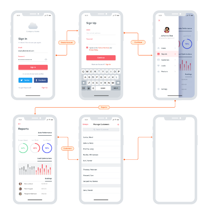
    In terms of shift left, you can start implementing your UI tests as soon as the team sketches out a rough prototype or mockup. Advanced UX designs like this are a great starting point:

    You really could start anywhere though. Even more rudimentary whiteboard sketches would enable you to start on UI test automation without waiting on the actual implementation. This means less crunch time each release and ultimately eliminates the ripple effect of testing delays, unfinished stories and “hardening sprints.” And it enables an interesting flavor of TDD: Start running these automated UI tests before implementation begins, then have developers write code that makes them pass.

    The catch? It’s not so easy to make UI test automation so easy. Two things to watch out for: accuracy and speed. For this to work, the technology must be able to accurately recognize and interact with UI controls that it’s never seen before. This requires visual object detection as well as optical character recognition (OCR). And that’s the easy part; the difficult part is doing this at speed. For a while now, AI-driven automation solutions have been struggling to come close to the speed of human processing. On average, you’re looking at tools processing 1.8 images per second, while humans can handle 25. You don’t need automation that mimics human speed, though—you need to beat it. If you want this UI testing to run as part of your continuous testing as a core part of your CI/CD process it needs to vastly surpass the speed of the human eye and the human brain.

    Once you overcome that little challenge, AI-driven UI testing will remove a lot of not-so-artificial conflict on Agile dev teams:

    • Testers waiting on developers to finish the UI so they can start implementing tests—and avoid the dreaded crunch time at the end of sprints.
    • Developers waiting on testers to finish tests so that the user story is deemed “done done” within the current sprint.
    • All the retro finger-pointing you get when delayed or unfinished testing results in unfinished user stories.

    I admit: when you first tell the team that UI test automation will help you complete testing sooner, it could be a hard sell. But after a few rounds of having UI test automation ready before developers write a line of code, I’m confident that you’ll find some real support for this artificial intelligence-driven testing approach.

  • The Emergence of UI and UX in DevOps Tools

    The Emergence of UI and UX in DevOps Tools

    Most of the popular DevOps tools on the market such as Puppet, Chef and Jenkins, are open-source and require a high level of proficiency. With the complexity comes the challenge of learning new frameworks and paradigms, a benefit to those who want to challenge themselves and learn new skills.

    But while these tools have become widely adopted, the widespread adoption of DevOps is creating a need for interfaces that cater to all users, from the most technical engineers to those who don’t want to learn, don’t see the value in learning or don’t need some of the top-end power that a complex scripting interface provides.

    It is for this reason that CloudBees developed Blue Ocean, a new interface for its continuous delivery tooling, and Red Hat released a user interface (UI) for Ansible.

    The Right Time for UI?

    Why have there not been UIs before now?

    I would say two reasons:

    1. Users did not demand nor care for one until now. A UI in many circles is seen to been more presciptive/restrictive of what can be achieved, and that only scripting/programming interfaces expose the real power to an engineer. Also, many of the most progressive engineers like scripting; they derive satisfaction from learning new skills, especially those that are the most highly desirable/in demand. And, I think many engineers like things because they are difficult to do; it’s a challenge, they have bragging rights and means they likely are getting paid more/are in demand.
    2. The open-source community is not as good at or geared toward building UIs.

    Why has a UI become important now?

    At MidVision, like many of the other commercial automation tool vendors, we have always believed that user experience and accessibility is critical, so we have provided command-line, scripted, API and GUI interfaces to our tooling. But this has not been the common approach.

    What makes this moment different is the wider adoption of DevOps automation tooling by groups that want at least graphical user interfaces (GUIs) and improvements to user experience such that you don’t need to be super-technical to be able to use them.

    The main groups we see are:

    • Business users within an organization. Continuous delivery/release automation tooling very much promotes collaboration, interaction and self-service, allowing release managers to see the status or pipelines, approve releases or initiate deployments. Managers may want to see dashboards and metric, produce reports or usage data. Other less technical staff, offshore teams, second level support, etc., may want to be able to provision, clone environments or deploy changes.
      There is a gap between the nerds in the basement speaking one language – and the business users who speak another which accessibility, UI and UX hopes to bridge.
    • Operations. There are certain parts of IT Operations that have welcomed the technical script-based tooling with open arms—it was a natural evolution for a UNIX system admin to become a DevOps/automation engineer. They can still script in shell (or are they meant to be doing it all in Python? ?). Again, some of the security tooling, storage, etc., are generally more comfortable down in the weeds. As you move up the stack however, toward the business application deployments, users are much more familiar and comfortable with UIs. Also, at this level dashboard, metrics, access control and reporting are much more important—and all of which are very hard to achieve without a proper UI.
    • Wider industry adoption. Adoption of the tools and techniques that are often advocated in the DevOps world started with the same poster child companies—Netflix, Twitter, Facebook, Google—and other newer companies that are cloud-native, have an open-source-first policy and are unencumbered by heritage technology stacks.

    We have then seen parts of enterprises adopt DevOps practices and tooling. Obviously, it is important to start small, establish value and then scale—running an initiative like you would a startup within an enterprise works well.

    Now that there is a compelling body of evidence to suggest that DevOps practices provide competitive advantage, cost savings, improved time to market, etc., other industries that are heavily dependent on technology have not had yet adopted these practices for varying reasons. Some parts of the finance and healthcare industries are two such areas. These industries have concerns around security and stability that may have slowed their adoption to date.

    Overall, however, this wider adoption means we need to cater not just for the new breed of DevOps engineers that are both system administrators and programmers and can script in Shell, Rudy and Python. We also need to cater to a wider group that either don’t have the skills to use these tools or don’t care for them.

    What change, then, are we likely to see?

    I believe DevOps tooling will evolve to provide new interfaces to cater to business users and self-service, and to make it easier to achieve the same thing without needing years of experience using a tool before being considered a competent user.

    I would compare many of the current tools today to a map and compass. Lovers of orienteering or mountaineering may suggest using a GPS or map on a mobile phone is cheating, cannot be relied upon or won’t provide the same same information as the contours on a 1 to 10,000 map. Or maybe you prefer vinyl to Spotify.

    Neither of these things are wrong; they are just not the only right. If you want to nerd out with your map and compass, vinyl LPs and Python scripts, I say fill your boots. All of which, BTW, I have some passion for! However, if you also want to get in your car, enter a zip code and know that it will get you there (accepting there is maybe a route that is slightly quicker if only you had done your research more thoroughly), this makes perfect sense to me.

    User experience is at the heart of the most of the other products we choose to consume, and I think many new and existing users will be pleased with UX becoming more important as tools like ours and others put this at the forefront of their design.

    About the Author / Dave Sayers

    Dave Sayers is a co-founder and technical services director of MidVision, a provider of Release Automation and Continuous Delivery Software. He works closely with customers and partners on DevOps and Automation initiaitves throughout Europe and North America and is responsible for devising and managing the partner and channel strategy. Connect with him on LinkedIn.
  • 7 Tips for testing the usability of mobile apps

    7 Tips for testing the usability of mobile apps

    Of the one million mobile apps, only half are used more than 5 times

    If you study any random cross-section of successful mobile apps and games you’ll find that they have one common factor. All of them are accessible. They have user interfaces that people can navigate intuitively without instruction. This is partly about building on expectations and established norms with Android, iOS, or whatever platform you are developing on. But there’s no substitute for thorough usability testing.

    According to Localytics, 20% of apps are used once and never opened again. Only 50% of apps are used more than five times. The window for app developers to impress and hook the user slams shut quickly and it stays shut. First impressions are vital if you want to boost retention rates and stand out in a crowd of over a million apps.

    It can be difficult and expensive to extract actionable data from usability tests. Here are a few practical tips for successful usability testing:

    1. Create a mock up – Starting with user-centric design is a smart move that will pay dividends down the line. You can save yourself a lot of time and money by discovering weaknesses and potential problems before the development really begins. There’s no reason you can’t mock up your user interface with simple screenshots and then frame it in an actual size smartphone surround. You can even do this with card and paper if need be. That way you can find out how potential users expect to interact with your app and identify the tasks that are most important to them. It’s a lot easier and cheaper to change your design on paper than it is to rewrite code.
    1. Examine how people interact – This applies to every usability test you conduct, whether it’s a paper mockup, a prototype, or the functional app on a smartphone. If you’re doing it in person then provide minimal guidance, ideally none at all, so you can uncover genuine failure points. Make sure to take plenty of notes. It’s not enough to just record what’s happening onscreen, you need to observe what people are doing with their hands, and see their facial expressions and body language. Are they trying the wrong gestures? Are they getting frustrated? Is it working the way they expect? Close observation will deliver the best insights.
    1. Test in the real world – If you can conduct tests in real world conditions in public then you might uncover some pertinent details about the usability of your app that you would miss in a controlled environment. This means conducting tests in real environments, whether it’s a busy shopping mall or a person’s home. It can be a good idea to avoid giving any instruction, that way you can see just how intuitive the design really is. There are services that offer video footage and audio narration of testers from around the world in different demographics using your app in real world conditions. Without the official framing of a test situation you have relaxed users and this can deliver different insights. Sometimes it might be more indicative of real world conditions to have someone test in their own home.
    1. Keep it short and simple – The longer a test is, or the more complicated it gets, the less likely it is your users will stay focused and interested. If they have to think too much about the parameters of the test and what you’re asking them to do then they’re less representative of an end user. This is particularly important when you’re asking members of the public to test in return for a small reward or for free. 
    1. Vary platforms and devices – Try to let people use their own devices wherever possible. That way the device won’t be a distraction and you’ll get data about different devices. The more variations you can cover, the more useful data you can gather. If you’re releasing on more than one platform then make sure you cover each one. You’ll need to cater for differences in expectations about standard platform navigation.
    1. Ask the right questions – Observation should be your primary source of data during usability tests, but you may want to ask some questions after each session. Be careful about what you ask and focus on getting actionable data. Asking if the app made them happy on a scale of one to ten isn’t going to tell you anything useful in a practical sense. You should also ask for elaboration, and where possible, have people show you what they mean using the app or prototype, rather than tell you, to avoid misconstruing any answers.
    1. Assess and act – You need to aggregate the data you collect and create a plan to assess it. Make sure you draw meaningful conclusions that are backed up by a weight of data. Don’t let personal bias cloud this process. You should be acting on the things that will resonate with the most end users. Just because one vociferous tester shouts louder than the others doesn’t make their feedback more important. Take your time, get further feedback on specific areas if it’s needed, and create a plan of action that you’re confident will result in concrete improvements, then test them again to confirm.

    There’s a lot of work involved in usability testing, but there’s no better way to improve the accessibility of your app and create a favorable first impression with the end user.

    About the Author

    Mush_Headshot cropMush Honda is QA Director at KMS Technology, a provider of IT services across the software development lifecycle with offices in Atlanta and Vietnam. He was previously a tester at Ernst & Young, Nexidia, Colibrium Partners and Connecture. KMS services include application management, testing, support, professional services and staff augmentation.