Tag: IT metrics

  • Opportunities and Challenges of Observability

    Opportunities and Challenges of Observability

    Observability platforms that unify metrics, logs and traces across applications and IT infrastructure are transforming how IT is managed. Most DevOps teams today are able to continuously monitor IT environments using tools that track a set of pre-defined metrics; observability platforms make it possible to aggregate data so that DevOps teams can launch queries that help them uncover the root cause of IT issues. DevOps teams leverage observability to allow them to understand what is happening within their applications more effectively and efficiently.

    Historically, applications were black boxes—meaning it was (and still is, in many cases) extremely difficult to know what is happening under the hood of the application.

    With the advent and subsequent growth of observability tools and techniques in the DevOps space, teams went from struggling to collect and understand the available data (which could vary from robust to almost non-existent) to easily aggregating data from numerous sources and being able to understand what that data means to being completely deluged with data—so much data it’s hard to keep up.

    Gather Data is No Longer Enough

    Josh Chessman, vice president of strategy and innovation at IT infrastructure monitoring specialist Netreo, explained that as applications become more and more complex, (e.g., running across multiple disparate environments with different technologies and in different locations) being able to collect data from these different environments is no longer enough.

    “Instead, DevOps engineers need to be able to collect the data and efficiently analyze it, too, to understand what is happening within the application,” he said. “Observability is the concept that drives this.”

    Chessman pointed out there are numerous observability issues DevOps teams face, but that they vary from organization to organization (and sometimes from team to team within an organization). 

    “Part of the problem is that many organizations simply lack tools to provide the data collection and analysis needed to move to an observability paradigm,” he said.

    This could be for numerous reasons, including budget (if you already have an existing tool, can you afford to acquire a new tool?), functionality (not all tools that claim to provide observability really do), implementation (this stuff is not easy and a poorly implemented tool could actually make things worse) and more.

    “One of the larger challenges I’ve seen is that organizations will go out and acquire an ‘observability’ tool and assume that is all they have to do,” Chessman said. “Unfortunately, that is not the case. Acquiring the tool gets you the technology, but the team must also be structured and ready to take advantage of the concepts and functionality provided by the tool.”

    GitLab’s senior director of product management Kenny Johnston explained that, on average, DevOps teams use five different observability tools which tend to inadequately connect developers to observability.

    In turn, developers struggle to respond to incidents swiftly while jumping across multiple tools and sources of truth and struggle to assign service level objectives (SLOs) and error budget definitions to the responsible product development teams.

    “To remedy this, we recommend adopting a unified software development solution that replaces the DIY ‘duct tape’ of products constraining developers and helps them deliver software more securely, at speed and scale,” he said. 

    Johnston said the most flexible and future-proof solutions today are open source tools like Prometheus and its ecosystem, as well as the OpenTelemetry toolset for more advanced use cases such as tracing.

    Prometheus has become very common in the developer space and, unlike other open source solutions or libraries, its format automatically emits metrics.

    “This allows for simple and future-proof interoperability, as one of the hardest things to change later down the line is code running,” he said. “Using open standards reduces the need for developers to rewrite and reintegrate the same type of code over and over again.”

    Observability Requires Understanding Your Goals

    From Chessman’s perspective, understanding what your goals are is critical for observability. 

    “Observability tools can do many things, but their primary function is to collect and analyze data,” he said. “While that is all well and good, if you do not define your KPIs from the beginning, all the collected and analyzed data is meaningless since you have no concept of what good and bad are.”

    Trying to define good and bad from the data collected is likely to result in failure because you are looking at where you are to figure out where you want to go.

    KPIs vary from application to application and, if you do not have them identified and well-defined before beginning down the observability path, it is that much harder, he said.

    Most tools (observability or otherwise) are capable of collecting hundreds if not thousands of metrics, but not all—not even most, in many circumstances—will be relevant to an organization. 

    “Instead of having to sift through the cruft to find the valuable data, it is better to start with identifying the valuable data and then figure out how to get there,” Chessman said. “If you don’t identify your KPIs in advance you could end up using the wrong KPIs for the wrong scenarios.”

    Johnston added that KPIs, like DevOps, are an iterative process and starting with KPIs helps developers create systems that can meet performance and availability expectations.

    “It’s important that DevOps teams continuously review their KPIs to allow for regular feedback on successes and failures,” he said.

    From his perspective, the best place to start for maintaining and improving observability is by storing observability definitions, instrumentation, SLOs, thresholds, incident response templates and dashboards as code.

    “This allows for rapid improvement via code changes by any team member, whether that’s a site reliability engineer (SRE), developer or platform team,” he said. 


  • Visualize Logs to Get More Value from Data

    Visualize Logs to Get More Value from Data

    Why do you keep logs? Regardless of the type of logs we’re talking about, you keep them because you expect them to provide some value for the organization. Maybe the logs will help you improve profitability; perhaps they will help you recover from downtime or perhaps they are expected to alert you to a security incident in progress. If you’re a system administrator or someone tasked with infrastructure reliability and maintenance, you’d agree that logs are critical. They represent the source of truth you go to for information about your server status and activity, website traffic, application performance and much more.

    No matter the intended purpose of logs or how you use them, the information in these logs should be easy to access and interpret. Today’s complex systems generate enormous amounts of log data, making it almost impossible to dig through tons of data in raw text files to find important information. Finding valuable information is immensely difficult in text logs but not in the visual world. This is precisely where log visualization comes into play. What if the data in your logs could transform into graphic shapes and patterns? Wouldn’t it be much easier and faster to decipher information from log data and understand it better?

    What are Logs, and What are They Used For?

    Before going any further, let’s make sure everyone is on the same page about the meaning of logs. A log is a textual, timestamped record that tells us what happened and when. DevOps engineers have to rely on a combination of logs from various system components and data sources to understand why an event occurred, and perhaps even predict future events.

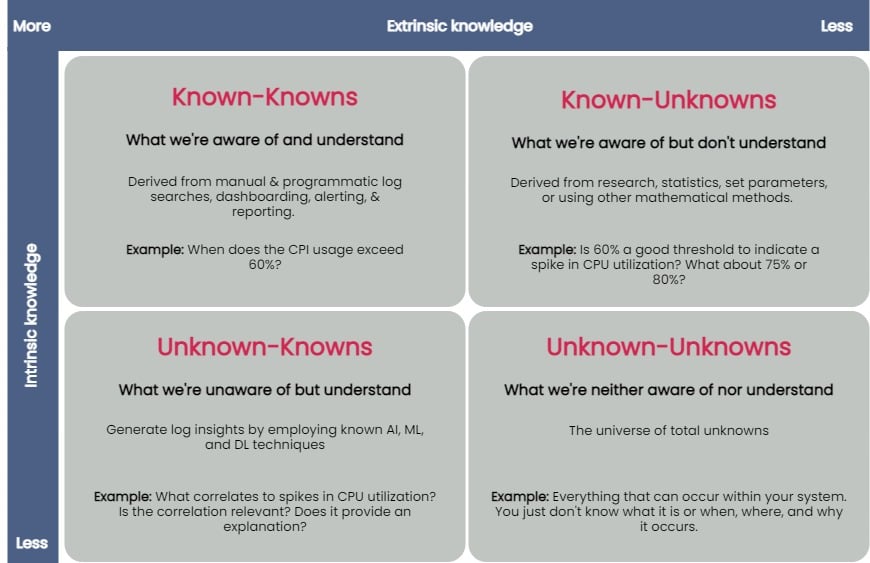
    logs value unknown


    You can taxonomize knowledge extracted from log data into four key groups: known-knowns, known-unknowns, unknown-knowns and unknown-unknowns. Manual and programmatic log searches, dashboarding, alerting and reporting manually extracted log fields are common ways to extract and analyze known-knowns. These methods assume that the engineer is already familiar with the data and knows where to look for answers. You can use statistics or other mathematical means to algorithmically resolve the known-unknowns, such as search terms and thresholds. The unknown-knowns are taken care of using AI/ML/DL techniques that generate log insights such as event correlations, log pattern clustering and known anomaly detection. But what about the unknown-unknowns?

    Uncovering Unknown-Unknowns

    With raw text logs, it’s relatively simple for engineers to conduct machine searches or set alerts upon encountering certain specific errors or specific types of behavior. However, to search through logs or even set up alerting parameters requires you to know what you’re looking for. If you have no idea what kind of errors or threshold limits for which you need to be alerted, it’s impossible to set these up.

    Modern applications are incredibly complicated, and one can not honestly understand everything about how they work or even always ask the right questions when things go wrong. But if an engineer reviewing logs doesn’t even know what to search for, it becomes impossible to figure out without an assistance tool like a purpose-built log visualization solution.

    For the most part, none of the techniques used to uncover the known-knowns, known-unknowns, and unknown-knowns of log data can help reveal the unknown-unknowns. An effective way of unraveling them is to rely on human intelligence to explore the unknown-unknowns space. Supplementing human intellect with a purpose-built log visualization tool can significantly help analyze the unknown-unknowns. Once you’ve recognized the unknown-unknowns, you can quickly feed this knowledge back into the appropriate, less esoteric groups (known-knowns, known-unknowns and unknown-knowns) and get more value from your log data.

    A good log visualization tool can aid in gathering knowledge from unknown-unknowns and can inform proactive log analysis or fast reactive log analysis use cases. Current log analysis practices center around reactiveness; the focus is to minimize and resolve issues after a problem has occurred. Using a log visualization tool, you can quickly isolate subtle and anomalous changes within a system by visualizing patterns generated from log data and exploring unknown-unknowns before an incident occurs.

    Current log visualizations are limited in display log count distribution and its variations. They do not visualize other log attributes or log combination attributes.

    All the UIs shown have similar function usage and displays. Drilling into an example of UI windows gives one the feeling of a typical log analytics practice. The figure below annotates different log analysis functions in the labeled, boxed area. None-visual log analytics functions such as search, tag, and log display are all required time-range input.

    log metrics annotate UI

    An ideal log visualization tool should not rely on just one information type. Log data is multifaceted. A log visualization tool can only begin to be valuable when it lets you focus on as many facets of log data as you can derive.

    Log Visual Pattern Discrimination

    The power of log visualizations comes from humans’ ability to recognize visual patterns. It’s hard to spot a pattern among raw log data, but it becomes easier once you can visualize that data.

    When an experienced DevOps operator looks at a log visualization, they can easily see where the anomaly is, even with no previous understanding of how the system works or where the anomaly might be coming from.

    Visualizations allow engineers to identify visual patterns and quickly understand what is going on in the system—whether it’s a hack in progress or an error causing a poor user experience. Visualizations are compelling, as they help shed light on important events, even if the engineer has no idea where to look or had no idea there was a hack going on in the first place.

    For instance, consider a scenario where a complex system generates millions of logs daily. Suppose we were to establish a baseline of the number of logs the system would generate when functioning normally. In that case, we’d have to take a daily count over a couple of weeks, or at least a month, to deduce a good-enough baseline.

    Even if we derive an acceptable baseline, we’d have to keep recording daily counts and compare it with this baseline to detect an anomaly. Doing this can be time-consuming and counterproductive as you might end up discovering an anomaly when it’s already too late to take any action.

    Once we plot logs daily on a graph, we can immediately figure out the baseline by observing it visually. Once we’ve visually established a baseline, we can instantly identify anomalies when we see values plotted above or below that established baseline. The following image visualizes logs ingested over ten days, illustrating how simple it is to establish baselines and identify when a system is doing something outside its usual behavior. This graph can deduce the baseline to be around 38,000 log records, with anything above denoting abnormal behavior within the system.

    log visualization

    Better Log Visualizations

    There are a few essential criteria for creating good log visualization analytics. They are:

    Use original log data. Data strategy is important. Most log data is unstructured by default, and many organizations tend to convert it to structured data before doing anything else with it. Doing so is a mistake, as you can lose vital pieces of information in the process. Good visualizations should be based directly on the logs exactly as the system produces them.

    Log data consistency. The format for the visualization should be consistent because if there are constantly changing variables, it becomes harder for humans involved to spot patterns.

    Choose robust log attributes and use them wisely. Instead of using just one log attribute for visualization (such as time distributed log density), you should look at visualizing more facets. Doing so gives analysts a better grasp of—and an intuitive understanding of—the log data set. For example, multiple pictures of an elephant taken from different angles help people understand elephants better than showing them only a single photo of an elephant taken from one angle. Similarly, if we break down logs by each of their attributes and then plot their frequency, we can better visualize how a system is performing. However, the attributes you pick are critical to providing valuable visualizations.

    With modern systems becoming even more complex, deciphering logs and uncovering unknown-unknowns will never be easy. The time is right to introduce new log visualization techniques to handle these unknown-unknowns. With log visualization becoming more user-friendly, you no longer need to count on people to be familiar with log interpretation or be aware of statistical, mathematical or AI techniques to analyze log data. Visualizing log data is not just a decision-making aid to human intelligence, discriminating between what is and isn’t acceptable and quickly identifying and remediating issues—the knowledge gained from unraveling the unknown-unknowns also helps advance AI/ML and automation techniques used to ascertain the knowns of your log data.

  • Visualization Shines a Light on IT Metrics

    Visualization Shines a Light on IT Metrics

    Modern IT departments operate in a pressure cooker. Their highly distributed infrastructures are spread across legacy data centers and hybrid and multiple public clouds. Now, the Internet of Things (IoT) and the edge are part of the mix.

    Massive amounts of data are flowing through these multifaceted environments, and it falls on IT to make sense of it all, ensuring that issues don’t become problems and that it’s viable to produce measurable outcomes for the business. Dashboards are instrumental for visualizing and quickly making sense of that data.

    Metrics – numeric representations of data measured over time – give IT operators and site reliability engineers (SREs) a window into how a system has historically behaved. That data provides insights as to how the system(s) should perform in the future, and aids investigations when something goes awry. IT monitoring tools act as giant data lakes, holding time series data, while dashboards give everyone from IT administrators to C-level executives ways to easily digest the data.

    The visualization market is evolving. We’re seeing different kinds of databases, such as Prometheus, which bring with them new tools to leverage the data. Prometheus (PromQL) is growing in popularity in the DevOps space and becoming the standard for monitoring containers and microservices because it makes it easier to manage time series data. PromQL also comes with client libraries that include four core metric types:

    • Counter: Represents a single monotonically increasing counter where the value can only increase or be reset to zero on restart.
    • Gauge: Represents a single numerical value that can arbitrarily go up and down, such as CPU utilization.
    • Histogram: Samples observations and counts them in configurable buckets. It also can provide a sum of all observed values.
    • Summary: Samples observations and provides a total count of observations and a sum of all observed values. Configurable quantiles are calculated over a sliding time window.

    Selecting Visualization Charts

    Selecting the appropriate visualization dashboard for each user is important to maximize the value of the data. There are traditional line and bar charts, single value tiles – which display a single data point at a specific point in time – and lists and gauges, which offer a single value at a specific point in time in a series.

    Newer visualization types are now becoming common to address the various use cases in ITOps and DevOps. Let’s walk through a few:

    1. Honeycombs offer big-picture views of IT infrastructure, yet also display detail. The hexagonal display mirrors those in a honeycomb, and helps DevOps pros slice and dice the data based on attributes or tags. Each hexagon represents a specific host or resource, and can be organized in logical groups of elements. The colors change when thresholds are reached, and the hexagons can be sized differently based on the value of the metric. Consider a case of many AWS EC2 instances scattered across the globe. Each hexagon can represent an individual instance, and they can be grouped based on the “region” attribute. This honeycomb chart would let administrators see how each infrastructure site is performing.
    2. Gauge metrics use a language like PromQL to set a ceiling and a floor. If the user creates alert conditions based on particular thresholds, the dashboard will indicate if a certain resource has reached its threshold by changing the color. A gauge that turns red may indicate a critical problem, for example. Managed service providers have SLAs with clients to maintain uptime. If a problem arises, a red indicator on a gauge tile lets the IT administrator know immediately that the SLA agreement has been breached, and that an issue needs to be addressed.
    3. Heatmaps provide a graphical representation of the volume of data points within bucketed ranges. The color of each cell of a heatmap directly reflects the density of certain metric value ranges. Heatmaps are used to display group trends and spot outliers, which make them useful when viewing metrics with a wide distribution of values.

    Role-Based Requirements

    Picking the right chart depends in part upon the people viewing the data. CXOs, IT managers, sysadmins, SREs, network engineers and network operations center (NOC) operators will have different, yet overlapping, requirements.

    For instance, SREs want to ensure the reliability and resiliency of the infrastructure, so, through their dashboards, they look at everything from availability and latency to performance, efficiency and capacity planning. They can quickly spot outliers like server downtimes or memory issues and immediately begin to troubleshoot.

    CXOs, conversely, don’t need to get into the weeds of infrastructure operations. They use dashboards to gain a macro view of metrics for performance over time across websites and networks. They need to understand the correlation between IT metrics and business services and applications. Dashboards should be able to connect those dots.

    Other Considerations

    Finding the right visualization option is important. Once that is done, there are some other steps to take to ensure you get the insights you need from your dashboard:

    Positioning and ordering: Dashboard tiles should be placed in a logical order, with important high-level statistics near the top and the deeper, and more granular metrics progressively moving to the bottom to give users a quick understanding of system performance.

    Design: A well-designed dashboard with consideration paid to color schemes and themes also will make it easier for stakeholders to digest and understand the data.

    IT infrastructure performance is crucial to the health of a company. Massive amounts of data streaming out of systems can help IT administrators and others keep up-to-date about that performance and the overall end-user experience. Dashboards offer flexible ways to quickly view and understand the metrics; IT organizations now have a growing range of charts to choose from that can present the data they need in a way that works best for them.

  • observIQ Lauches Open Source Log Agent Project

    observIQ Lauches Open Source Log Agent Project

    Blue Medora, after selling its core monitoring integration platform to VMware, today changed its name to observIQ and launched an open source agent project that will serve as the foundation of a log management tool to be delivered as a software-as-a-service (SaaS) application.

    Company CTO Mike Kelly said the observIQ agent, which is written in the Go programming language, will provide IT teams with access to highly configurable agent software that doesn’t adversely impact performance. In contrast, existing open source log agent software requires IT teams to sacrifice one for the other, he said.

    Because the observIQ agent is highly configurable, it will also serve to make it easier to collect a wide range of metrics that can be consumed by a wide variety of management tools, Kelly added.

    The company will employ observIQ to collect metrics for observIQ Cloud, a SaaS platform currently in beta, in addition to continuing to invest in BindPlane, an IT operations data management platform developed by Blue Medora that delivers a relationship-aware stream of metrics and logs in real-time.

    Kelly said IT teams need access to a highly configurable agent software because the types of metrics that need to be collected continue to expand and evolve.

    At the same time, Kelly notes IT teams need to be able to affordably instrument many more applications, which becomes difficult to achieve when relying on commercial agent software.

    Finally, as IT environments become more complex, organizations are embracing best DevOps practices to manage applications, which requires organizations to increase dramatically the level of observability they have into any application environment. The issue DevOps teams encounter is they wind up having to support multiple agents, so if an open source project leads to fewer agents that need to be maintained and updated, that might be a benefit that resonates.

    In the meantime, as log management heads into the cloud along with most other IT management services it’s also becoming easier for IT teams to manage applications from anywhere. Most IT teams are going to be working remotely much more often than they did prior to the onslaught of the COVID-19 pandemic. That transition is easier to achieve when the tools being relied on reside in the cloud.

    Many IT teams also tend to limit their use of log analytics because of the costs associated with storing and collecting data. To limit those costs many IT organizations opt to only store log data for a limited time or only collect metrics for their most critical applications. The challenge is, the percentage of applications deemed critical continues to increase.

    Of course, competition across providers of log management tools that can be accessed as a service is already fierce, so observIQ will have its work cut out establishing another platform. However, if DevOps teams adopt its open source agent software, there’s naturally a much higher chance organizations will wind up employing observIQ Cloud.