CodeSee this week launched an enterprise platform based on its codebase visualization and mapping tools that makes it easier for developers to navigate and learn how an application was developed.
CodeSee CEO Shanea Leven said this capability makes it simpler to understand how a codebase is constructed, including the application programming interfaces (APIs), without having to read each line of code. Organizations can use the CodeSee Enterprise platform to review code in addition to making it easier to add new developers to a project, she said.
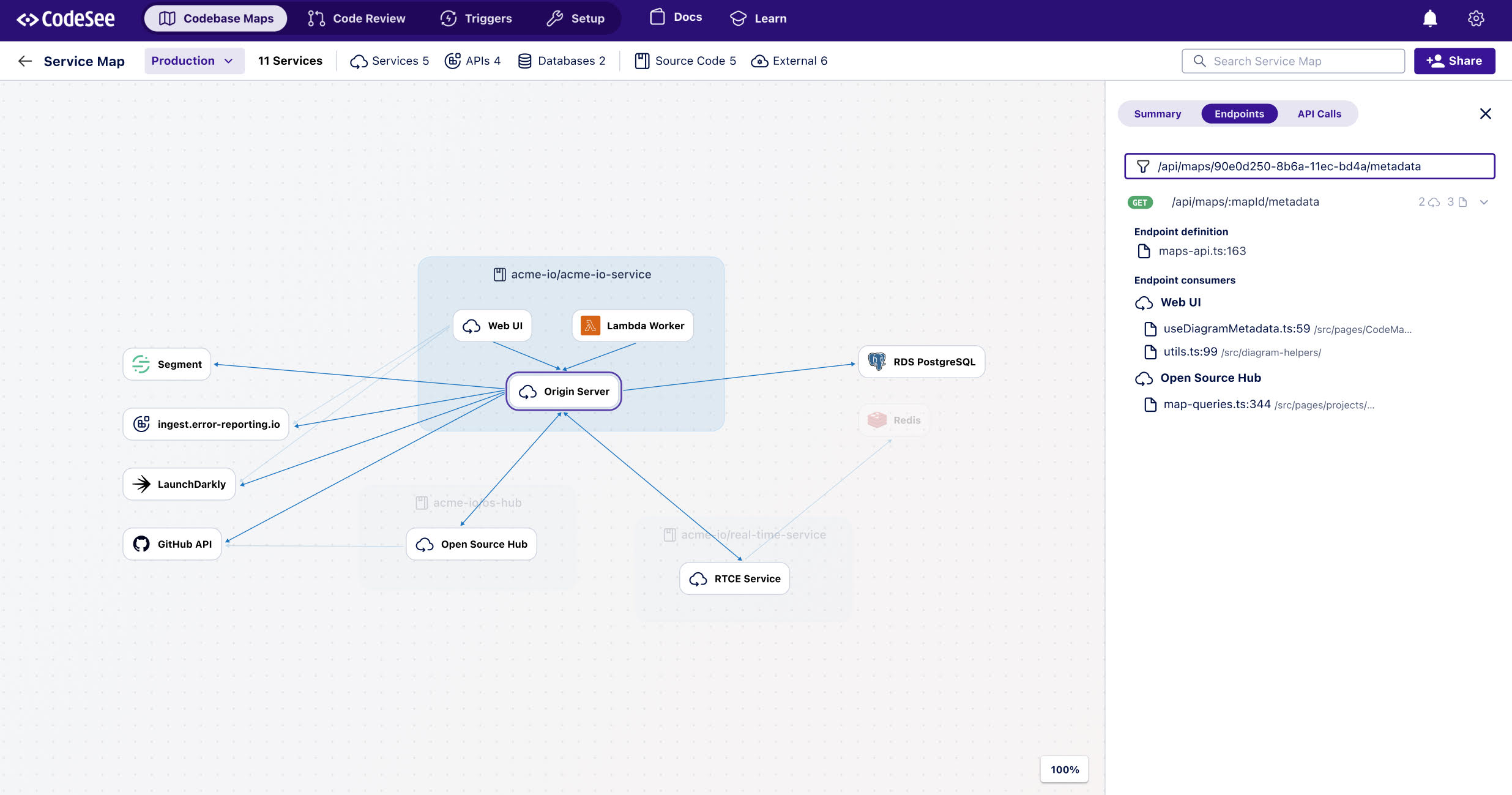
The CodeSee Enterprise platform makes it possible to automatically detect, visualize and link to the code used to create every connection between the services that make up an application. That capability is especially useful for any security review of an application before or after an application is deployed.
A code automation feature codifies and automates the code knowledge that previously could only be passed from one developer to another, Leven noted.
It takes a significant amount of time for developers to pore over a codebase to understand where they might contribute. The larger a codebase is the more challenging it becomes to make meaningful contributions.
By definition, application development in the era of microservices is now a group effort. The days when a lone developer cared for an entire application are long over. The issue is finding a way for teams of developers to more easily collaborate when most of them may have never actually met in person.
The amount of focus on developer productivity has increased substantially since the start of COVID-19 pandemic spurred organizations to accelerate a wide range of digital business transformation initiatives. Developers are generally challenging to recruit and retain, especially individuals familiar with the latest cloud-native platforms for building and deploying applications. Making it possible for developers to more easily contribute to multiple application development projects has never been more critical.
Of course, most developers would rather spend more time writing code rather than studying it. The amount of time devoted to understanding codebases and maintaining development environments far exceeds the amount of time spent writing code. Many developers are not always going to be able to take advantage of advances in application development without the aid of a DevOps team to provision new tools and platforms.
One way or another, the rate at which applications are being developed and deployed needs to accelerate. An uncertain economic outlook is increasing the pressure on business leaders to digitally transform processes in a way that increases both revenue and profitability. The application experience is especially critical because customers are not inclined to patiently wait for organizations to finetune their digital processes over an extended amount of time.
Less clear, however, is the level of stress individual developers might be willing to tolerate. There’s no doubt most of them are sympathetic to the needs of the organizations that have hired them but that does not necessarily mean they’re willing to continuously work overtime to achieve goals that might not be attainable using the tools they have at hand.
Detecting a cyberattack can take more than 200 days. During this time, attackers might be exploiting your system while you are completely unaware. Cyberattacks can cost affected organizations as much as $13 million per year.
What if we could reduce the time to detect a cyberattack all the way down to zero? How much money could you save by detecting and stopping an attack while it is still happening?
And what if we could do even better than that? What if we could detect security vulnerabilities before an attack even occurred?
Security observability is critical to achieving these goals. Let’s take a look at what security observability means and how distributed tracing, which is one part of observability, can help to defend your business from cyber security threats.
What Is Security Observability?
Knowing what is happening inside software is the best way to learn how to defend it. Observability refers to the ability to see the state of a system at any time. It’s like opening up a watch and watching the gears turn.
Applications and services constructed using APIs and microservices have an advantage over other systems because you can more easily observe what’s happening inside of them. You add hooks to the APIs and microservices and use additional tools to collect the details.
This presents us with an opportunity to better secure applications and services against cyberattacks by allowing us to see exactly what is happening inside the system.
The Three Pillars of Observability
Three types of data are needed to make a system observable. These are commonly referred to as the “Three Pillars of Observability:
Logs: Raw data, recording every activity that happens in the system
Metrics: Aggregated performance metrics, such as CPU load and memory usage, collected as min, max, average, number of counts, and so on
Distributed traces: The complete path a request follows as it flows through the microservices
Data analysis/visualization tools (sometimes referred to as the “fourth” pillar).
Yes, that makes four, but this item isn’t data. The above data is too complex to digest directly, making these tools paramount to achieving observability.
Figure 1. Sending observability data from the microservices to their respective collectors.
The three pillars are shown in the diagram in Figure 1. Each microservice in the diagram contains additional code that sends logs, metrics, and traces to their respective collectors. These collectors gather the data, store it, filter it, and pass it forward to analysis and visualization tools that make the data usable by humans.
Traditional security tools, such as SIEMs, make use of logs and metrics to secure a company’s assets. However, these tools fall far short of protecting applications.
Limitations of Logs and Metrics for Protecting Apps
Logs and metrics begin to paint a picture of what is happening inside your APIs/microservices. But the picture is incomplete. Logs and metrics can help developers ensure that the system is working properly and they can help with solving problems during debugging. But they do not provide enough information to protect the system from cyber attacks.
Logs: Just the Facts
Every time a microservice is called or a request is generated, a message describing that activity is sent to the log collector.
Code Snippet 2. Example of a log message, indicating that Service A has received a GET request.
This message contains information about what has happened, but it is in a very raw form. You can think of a log as a fact. It doesn’t provide any real understanding of what happened in the system.
If this GET request was the first step in an attack, we can’t tell that from looking at the logs alone.
Metrics: Adding Insights – What Happened
Metrics are aggregated data collected from microservice activity. Metrics may include things like CPU usage, memory usage, execution time, number of calls or requests per unit of time, and so on. Each metric is associated with the microservice that recorded it.
Figure 2. Metrics example, showing the number of calls received for the Login service. What do the spikes reveal? Are they attacks, or are they normal user behavior?
Figure 2. shows activity over time for a login service. The login activity is usually uniform and consistent, but there are very large spikes that occur occasionally.
The spikes show that there are bursts of login attempts that are occurring occasionally on a system. They could indicate that a hacker is sending a brute force attack, attempting to guess usernames and passwords for administrators in the system. Or they could indicate a hacker is trying to overload the server with a Denial of Service (DoS) attack.
But these spikes might indicate normal user activity. Perhaps many users are running an app simultaneously because they just saw a compelling television commercial that was aired during the Super Bowl halftime. Or maybe everybody is contacting Uber to request a ride at the same time because a Rolling Stones concert just ended.
Another possibility is that these bursts of activity indicate a bug in the system. Maybe there is some sort of unforeseen infinite loop that is causing an unexpected burst of activity.
We just don’t know what is causing these bursts. To gain the insight we need to secure APIs, we need to know what happened before this metric was generated. We need the ability to work backward.
Distributed Tracing: Context and Causality – Why Things Happen
Distributed tracing can help us understand the reason things happen. When we know why things happen, we can determine if an attack is underway.
Figure3. A “span”, or trace, showing the path a request follows through the API/microservices system.
Distributed tracing is a form of tracing that is specially adapted to microservice architectures. It allows us to observe each request traveling through the system from its beginning to its end. We can use traces to improve performance and understand what typical behavior looks like.
But traces also give us the power to identify attacks on our microservices and stop them.
Traces show the entire path a request followed through the edge API and microservices. They can tell us:
If the request went through all of the required services, including authentication and authorization checks
If the request called any unexpected services or granted access to unauthorized data
Where the request entered the system. (If a request entered without going through an edge API, also known as an API gateway, there may be a problem)
The IP address that originated the request
And if they are working especially well, traces might even help identify an attacker.
Data Analysis and Visualization Tools: Seeing What Humans Can’t
In a real system, there may be hundreds of different paths requests can take, just like the one shown in figure 3. And each request could touch tens or even hundreds of services. While distributed tracing gives us the ability to observe all of these, the complexity makes it impossible for humans to gain much insight.
Machine learning and data visualization tools can identify patterns in the data, in order to identify normal behavior and abnormal behavior, and can even create alerts when abnormal behavior is detected.
These patterns of normal and abnormal behavior help us to identify security vulnerabilities and attacks within APIs and microservices.
Tracing to Reveal Vulnerabilities
The diagram in Figure 4 shows the combination of traces through a system. We can use this diagram to identify possible security vulnerabilities.
Figure 4. Possible security vulnerability, indicated by the red-colored trace. The diagram shows that this group of requests may inadvertently grant unauthorized access to the user’s account-info.
Figure 4 shows a pattern that contains an “Excessive Data Exposure” vulnerability, which is vulnerability #3 in the OWASP API Security Top 10. The pattern shows that when a user views a shopping cart, the API will also return the user’s account information. This unnecessary information may include personal information, account information, or financial information a hacker can exploit.
These insights help developers recognize potential security vulnerabilities and correct the code to eliminate them.
Tracing to Detect Attacks in Real-Time
Tracing can monitor each request and compare it to established norms. The system can generate an alert if a trace deviates from this expected behavior.
Figure 5. Possible attack in progress. The diagram shows that a possible attacker may have found a way to bypass a required authentication or authorization step.
Figure 5 illustrates a pattern that could indicate either a “Broken Object Level Authorization” attack or a “Broken User Authentication” attack, which are #1 and #2 in the OWASP API Security Top 10 vulnerabilities.
This figure indicates that an attacker has found a way to enter another user’s shopping cart and possibly obtain information for that user, by bypassing either an authorization or an authentication check.
Typically, tracing allows us to go back in time to find attacks such as the one above. Can tracing help to stop attacks in real-time?
Yes, tracing provides the information we need to detect and stop attacks in real-time. However, more is needed. A sophisticated AI on top of a tracing mechanism would be able to notice abnormalities humans may miss and can stop abnormal behavior before any damage is done.
Tracing plus AI gives us real-time security observability. In a future blog post, we’ll discuss how AI takes what tracing gives us and uses it to create real-time protection against attacks.
Use Distributed Tracing to Defend Your APIs
Cybercrime is expensive, and it can take a long time to detect an attack. Attackers are creative, and older techniques using logging and monitoring do not give enough insight to recognize an attack when it happens.
Security observability uses internal states to thoroughly comprehend what is happening inside your API/microservices system with the goal of protecting them from attack.
Observing your software, using logs, metrics, and most importantly, distributed traces gives you the opportunity to identify attack patterns, eliminate security vulnerabilities, and block attacks before they can cause serious damage. View a recorded Traceable demo to see for yourself.
Modern IT departments operate in a pressure cooker. Their highly distributed infrastructures are spread across legacy data centers and hybrid and multiple public clouds. Now, the Internet of Things (IoT) and the edge are part of the mix.
Massive amounts of data are flowing through these multifaceted environments, and it falls on IT to make sense of it all, ensuring that issues don’t become problems and that it’s viable to produce measurable outcomes for the business. Dashboards are instrumental for visualizing and quickly making sense of that data.
Metrics – numeric representations of data measured over time – give IT operators and site reliability engineers (SREs) a window into how a system has historically behaved. That data provides insights as to how the system(s) should perform in the future, and aids investigations when something goes awry. IT monitoring tools act as giant data lakes, holding time series data, while dashboards give everyone from IT administrators to C-level executives ways to easily digest the data.
The visualization market is evolving. We’re seeing different kinds of databases, such as Prometheus, which bring with them new tools to leverage the data. Prometheus (PromQL) is growing in popularity in the DevOps space and becoming the standard for monitoring containers and microservices because it makes it easier to manage time series data. PromQL also comes with client libraries that include four core metric types:
Counter: Represents a single monotonically increasing counter where the value can only increase or be reset to zero on restart.
Gauge: Represents a single numerical value that can arbitrarily go up and down, such as CPU utilization.
Histogram: Samples observations and counts them in configurable buckets. It also can provide a sum of all observed values.
Summary: Samples observations and provides a total count of observations and a sum of all observed values. Configurable quantiles are calculated over a sliding time window.
Selecting Visualization Charts
Selecting the appropriate visualization dashboard for each user is important to maximize the value of the data. There are traditional line and bar charts, single value tiles – which display a single data point at a specific point in time – and lists and gauges, which offer a single value at a specific point in time in a series.
Newer visualization types are now becoming common to address the various use cases in ITOps and DevOps. Let’s walk through a few:
Honeycombs offer big-picture views of IT infrastructure, yet also display detail. The hexagonal display mirrors those in a honeycomb, and helps DevOps pros slice and dice the data based on attributes or tags. Each hexagon represents a specific host or resource, and can be organized in logical groups of elements. The colors change when thresholds are reached, and the hexagons can be sized differently based on the value of the metric. Consider a case of many AWS EC2 instances scattered across the globe. Each hexagon can represent an individual instance, and they can be grouped based on the “region” attribute. This honeycomb chart would let administrators see how each infrastructure site is performing.
Gauge metrics use a language like PromQL to set a ceiling and a floor. If the user creates alert conditions based on particular thresholds, the dashboard will indicate if a certain resource has reached its threshold by changing the color. A gauge that turns red may indicate a critical problem, for example. Managed service providers have SLAs with clients to maintain uptime. If a problem arises, a red indicator on a gauge tile lets the IT administrator know immediately that the SLA agreement has been breached, and that an issue needs to be addressed.
Heatmaps provide a graphical representation of the volume of data points within bucketed ranges. The color of each cell of a heatmap directly reflects the density of certain metric value ranges. Heatmaps are used to display group trends and spot outliers, which make them useful when viewing metrics with a wide distribution of values.
Role-Based Requirements
Picking the right chart depends in part upon the people viewing the data. CXOs, IT managers, sysadmins, SREs, network engineers and network operations center (NOC) operators will have different, yet overlapping, requirements.
For instance, SREs want to ensure the reliability and resiliency of the infrastructure, so, through their dashboards, they look at everything from availability and latency to performance, efficiency and capacity planning. They can quickly spot outliers like server downtimes or memory issues and immediately begin to troubleshoot.
CXOs, conversely, don’t need to get into the weeds of infrastructure operations. They use dashboards to gain a macro view of metrics for performance over time across websites and networks. They need to understand the correlation between IT metrics and business services and applications. Dashboards should be able to connect those dots.
Other Considerations
Finding the right visualization option is important. Once that is done, there are some other steps to take to ensure you get the insights you need from your dashboard:
Positioning and ordering: Dashboard tiles should be placed in a logical order, with important high-level statistics near the top and the deeper, and more granular metrics progressively moving to the bottom to give users a quick understanding of system performance.
Design: A well-designed dashboard with consideration paid to color schemes and themes also will make it easier for stakeholders to digest and understand the data.
IT infrastructure performance is crucial to the health of a company. Massive amounts of data streaming out of systems can help IT administrators and others keep up-to-date about that performance and the overall end-user experience. Dashboards offer flexible ways to quickly view and understand the metrics; IT organizations now have a growing range of charts to choose from that can present the data they need in a way that works best for them.
Logi Analytics launched a tool that promises to make it easier to design, build and embed interactive dashboards and data visualization within applications.
Company CEO Steven Schneider said Logi Composer helps ease the task of creating data visualizations within the context of a DevOps workflow.
Based on technology Logi Analytics gained via its acquisition of Zoomdata last year, Logi Composer enables DevOps teams to create interactive self-service dashboards for end users as part of a microservices architecture based on Docker containers, he said.
To help achieve that goal, Logi Composer includes support for a range of Smart Data Connectors constructed as a set of microservices to access databases and other things.
Schneider said as applications evolve developers increasingly are being required to embed business intelligence (BI) functionality within their application. However, he noted, most end users don’t want to move data into a separate BI application to analyze trends when they could be surfaced more easily within an application they are already using.
The challenge has been finding a way to provide developers with a set of tools for building self-service visualizations in a modular fashion that makes them easier to build, maintain and update, he said.
Of course, developers have been adding visualizations to applications for years. But most of those visualizations don’t let end users interrogate data—users now expect to be able to manipulate visualizations with a modern application at a much deeper level, said Schneider.
Data visualization is a critical aspect of every digital business transformation initiative. As organizations look to digitize more processes in the wake of the COVID-19 pandemic, the need for more robust data visualization capabilities within applications has become more acute. Most end users are unable to make sense of massive amounts of data without the aid of visualization tools.
It’s unclear to what impact embedding BI capabilities within applications will have on standalone BI applications. There may always be analysts who want to pull data from multiple application sources to analyze trends. However, the bulk of users are likely to have their BI requirements met within an application that includes connectors to pull in external data when required. Applications that don’t include data visualization capabilities are not likely to be widely employed by users.
Ultimately, embedded data visualization will reduce reliance on both spreadsheets and standalone BI applications. However, like most substantial changes to end user behavior, it may be a while before that cultural shift takes hold.
In the meantime, DevOps teams should expect to see a lot more analytics functionality being embedded within applications. The challenge now is finding a way to streamline the development and deployment of those modules within the context of a larger application development project.
Embedded analytics are a powerful tool for adding value and stickiness to your desktop and mobile apps. Many app developers are providing these features as standard in their tools. But should independent software vendors (ISVs), systems integrators (SIs) or companies building internal apps build analytics tools in-house, or should they buy them from specialist providers?
There are many considerations to the buy or build dilemma. One reason many developers want to build in-house is the limitation of support services from embedded analytics vendors. Although most providers offer support services, these are not normally included in the price of the package, and are offered at an additional cost. However, in the majority of cases, such support services are in fact effectively a requirement to ensure the visualization is tailored to the use case and look and feel of the app.
A second consideration is cost. Standard price entry points for embedded analytics can start at $30K to $75K per year. However, behind the upfront pricing structure, there are often multiple levels of service, as well as limits on usage and number of applications the embedded analytics can be used in. This can make pricing far less predictable.
Creating analytics features in-house may be the best option when working on smaller projects with limited sets of requirements—especially if your development team has a relevant skill set and previous experience developing embedded analytics and data visualizations.
Lastly, one of the most convincing arguments for building in-house is that product managers remain fully in control over every aspect of their application, not just its functionality but the look and feel as well. By keeping all aspects of development in-house, product teams can control branding, user experience and functionality. The loss of this control is one of the main disadvantages of buying.
On the other hand, there are many benefits to buying rather than building. The main disadvantage of building in-house is that developers have to switch their focus away from working on the core product to create complex embedded analytics features. Buying saves time and money over training a development team that may lack previous embedded analytics experience and eliminates the need for training where internal resources are simply not available.
There is also a significant cost associated with building embedded analytics, which on average takes seven months to complete. The estimated average in-house cost can run as high as $350k (based on average U.S. salaries). This includes: four software developers for seven months, one QA professional for seven months, two UX/UI designers for six months and one data scientist for one month.
Your in-house team is generally responsible for supporting anything built in-house. With the buy option, support is provided by the third party via the cloud and ISVs will not have to allocate resources to fixing issues if and when they occur. As much as 90% of the cost of software during its lifetime is tied to keeping it up and running. Maintenance costs can be significant.
The time it takes to bring a product to market is another consideration. With average build-it-yourself times taking seven months or more, many product teams decide to buy a bolt-on analytics solution due to the need to release a product as quickly as possible. In a fiercely competitive SaaS market, and with CEOs demanding quick turnaround, buying a pre-built, off-the-shelf solution drastically reduces your time to market.
Making a final decision on whether to buy or build is a complex task. But in the end, ask yourself:
Can my team develop powerful analytics in-house or do I need a specialist? Building analytics tools can be a drain on time and internal resources, and the backend powering even a simple dashboard can be slow and expensive to build from scratch. Plus, you need the resources to maintain it.
How does the vendor’s pricing model stack up against my budget? You shouldn’t really be paying any more than what it would cost you to simply build the visualization in-house, so an affordable vendor is essential. However, too often, overly complex pricing structures from vendors result in unpredictable costs, making ROI hard to judge.
Has the company received awards for its work? Are they well established and respected in the community? Third-party review sites are helpful here.
How much do you trust the vendor? If you are collecting sensitive data, you want to be sure that the vendor isn’t also collecting that information covertly and selling it.
As more organizations realize just how important understanding their data is, embedded analytics have become the key to harnessing that power. Whether you decide to allocate internal resources or hire a vendor, including powerful embedded analytics and visualizations is virtually a must since it helps you differentiate your app and keep users engaged.
Big data is an older fashionable term that, when combined with agile methodology, AI and ML and analytics, has become a powerful trend once again in data operations (DataOps). If you’re a systems architect, it pays to understand the philosophies, benefits and tools to power DataOps and improve your data-driven applications. This article serves as a guide to define enterprise architectures that support the needs of an organization.
Inside Statistical Process Control (SPC)
The DataOps Manifesto defines a set of key principles to guide systems architects and implementation teams. In summary, they focus on the customer and analytics, driving positive change through a continuous improvement process that relies on both teamwork and automation to help drive efficiency and overall data and system quality. This is based on statistical process control (SPC), which is a quality-driven approach to using data and associated statistics to monitor, control and improve systems and processes. Quality, in this sense, translates to maximum application uptime, increased usefulness to the customer and reduced waste in terms of delivery time and resource usage.
Data is king in SPC, and most data-driven application architects go through a set of phases when they design systems. These phases include:
Data Discovery: Knowing the sources of data used by applications, as well as identifying new sources of data about your applications and their environment. This includes performance statistics and other systems and process measurement data.
Data Relationships: From the data and their sources, knowing the relationships and hidden value in your data is the next phase. This is the realm of big data and analytics where you search for business meaning buried in the data to be used to expand your offerings to customers while also enhancing and improving the customer experience.
Data Monitoring: This means you want to ensure system uptime by monitoring your data-critical systems (e.g., data feeds, databases, analytics and so on), but it also includes automation of the first two phases above.
In line with SPC, performance data is used to ensure that your systems and their processes are stable, with the uptime and responsiveness needed to meet customer demand. To achieve this, the reach of DataOps extends from the data scientists and business analysts within your organization who solve business problems with data and algorithms, through to the database administrators and the developers who work with that data (e.g., ETL) and build applications from it.
From here, DataOps gives you insight into value discovery, turning these into new methods and tools, with an emphasis on continuous refinement. Tools and techniques will help you automate data mining, the discovery of potential performance improvements, identifying areas to create more efficiency and lower costs and prepare you for the future in terms of business and architectural needs.
Leveraging DataOps: Automation Is Key
Putting feedback loops in place helps to automate the entire data flow, from business intelligence, where tools are used to help data analytics processes, to data science, where new mathematical and architectural approaches are used to drive deeper understanding data, to developers and operations staff, where the data is aggregated into applications and further measured to drive new value back through this process.
Automation is used to build efficient feedback loops without overburdening your IT staff. In turn, automation tools are used not to replace your analysts, data scientists, developers or other IT personnel, but to enhance their jobs and make them more efficient at what they do. As data production and consumption continue to grow, your organization’s ability to discover hidden value in this data and drive it through to real system improvement will be a key competitive advantage.
AI-Driven DataOps
While data visualization is important to effective DataOps, displaying graphs and pictorials can go only so far. Gaining actionable insight into metrics is what drives improvements in performance and efficiency. To remove the potentially error-prone manual approach to achieve this, organizations are leveraging an AI-driven approach to DataOps. This helps discover hidden dependencies between applications and their resources (e.g., databases and other data sources) along with their users and their needs, providing unified visibility and operational intelligence to optimize your entire ecosystem.
AI can help you dive deeper into the effectiveness of your data, going beyond operational efficiencies to identify improvements to code, overall system architecture and the configuration tools and frameworks in place across the cloud or data center. Going further, AI-driven DataOps can help you optimize your consumption of cloud-based resources or identify key components to migrate (with recommended changes to deployment) when moving to the cloud.
The Big Picture: Cloud, Microservices, Serverless and DataOps
As a systems architect, you need to maintain a big-picture view of the data, systems and processes used within your organization to best serve your customers. This means you need to understand the entire application ecosystem to communicate and simplify your system and data operations. Tools help provide and maintain a 360-degree view into the performance, interactions and dependencies between components in your software systems and data workflows, along with all of the storage, compute and network infrastructure that supports them.
To enable the value in DataOps and drive visibility of the data and interactions within your systems, adopting newer architectural approaches can help. For instance, breaking apart monolithic applications using a microservices approach helps drive real value throughout your technology ecosystem; it helps improve the makeup and velocity of your development teams, improves the benefits of operational efficiency, drives a test-driven approach to development (since these services are more easily verifiable) and helps enable cloud deployment.
Other approaches such as the use of containers and serverless architecture help remove system dependencies from implementation, reducing the impact of deployment changes on your applications’ code. With all of these changes, the data orchestration and workflows without your applications (including your customers’ usage of this data, in some cases) become more apparent and measurable.
Call to Action: Leverage Tools and Frameworks
DataOps helps operations staff, app developers and enterprise architects reduce the complexity of delivering reliable application performance. Whether you’re new to DataOps or have been on board for some time, knowing the tools and frameworks to help drive both your architectures and operational control is key to success. Tools such as those from Unravel (see Figure 1) provide monitoring solutions that map dependencies between applications and their data sources, and all of the components in between.
Figure 1: DataOps tools such as the one from Unravel should support your existing implementation and technology choices, while supporting the three phases of DataOps work.
The tools you use should automate the discovery of value and optimizations to be made, where possible, from the viewpoint of business owners, IT operations staff and the data scientists and developers defining and building the systems. All of this should be achievable regardless of the platforms, frameworks, languages and cloud providers you use to enable your applications and users. Finally, make sure your DataOps approach and tools support your organization in the future, with support for continuous improvement of overall architecture as well as data processes.
This sponsored article was written on behalf of Unravel.
When Peter F. Drucker, the father of modern management, performed a two-year in-depth analysis of the General Motors corporation in the 1940s, he undertook what may have been the world’s most ambitious big data analysis ever at that time. However, when he gave the results to GM chairman Alfred Sloan, Al was not happy.
In fact, Sloan refused to acknowledge Drucker’s work. He never mentioned it again and banished his colleagues from referencing the resultant book (Concept of the Corporation) around him.
Alfred Sloan may not have been ready to act upon the harsh reality of his company’s data, but modern businesses thrive on this sort of analysis. Big data has consumed every industry on earth, from automobiles to cosmetics to hotels and far beyond.
Businesses that use the power of data visualization will outperform the ones that don’t, every time. If you are responsible for the success of a B2B business, this article is going to show you why data visualization is one of the most powerful tools at your disposal.
The Goal of Data Visualization
There are two ways you can use big data visualization tools to make your data work for you. You’ll make it easier to parse your own data, identifying trends and finding opportunities to improve your business. You’ll also use it to convey your ideas to other people, improving your conversion rate for B2B sales that can make or break your bottom line.
Understanding Your Data
When it comes to better understanding your own data, visualization is everything. Even a small business has an incredible amount of data at its disposal. Social media statistics, front-end stats such as how long users spend on certain web pages, sales and refund statistics by time of day and product … the list goes on and on.
You have to start by figuring what data is most relevant. Ed Baker, former head of growth at Uber, points out that every great business needs a “north star metric.” This is the single variable that, if it improves, the entire business does better. Once you identify your north star metric, you can see how other variables feed into that metric. Data visualization is crucial for parsing the information and making these big decisions.
Conveying Ideas to Other Businesses
You can use well-visualized data to convey ideas to other people that might be near-impossible to express otherwise. Have you ever sat in a meeting, desperately trying to show somebody why your idea makes sense, and yet completely failing to do so?
I’ve had conversations where my brain is about to melt out of my ears, because I think I’m making perfect sense yet the other party simply does not grasp the idea. In a B2B context, this failure to communicate can cost hundreds of thousands of dollars. That’s a critical failure to get the job done. Data visualization is a very cost-effective way to improve your odds of making the sale.
When you’re trying to sell a premium service or product to another business, don’t just tell them why it makes sense—show them. Use the visualization techniques in the rest of this article to remove all doubt that you’ve got the right idea.
The 7 Basic Tools of Quality
There are dozens of different ways to visualize data. It depends on what kind of information you want to look at. However, the best way to start is by understanding the “seven basic tools of quality.”
Made famous in post-war japan by Kaoru Ishikawa, these tools are simple yet potent data visualization methods that most people can learn in a few hours. While not the most intricate or powerful visualizations available, they are elegant and widely understood. When you use one of these tools, you can rest assured that everybody at the table will be comfortable following along.
You want to use these methods of visualization whenever it is possible. Only move into more esoteric or powerful tools when the situation necessitates it. By the time you are working with complex multi-variate data visualizations, you’ll probably need a dedicated data scientist to make it all work. These tools are an easy and cost-effective way to get started.
Here are the seven basic tools, with a brief synopsis of how each one works:
Cause-and-Effect/Fishbone Diagram
A quick and simple method to use when you are working backwards from a known outcome, asking the question: “Why did it happen?” This tool is often too simple for detailed analysis, but can be great for mid-conversation visualizations on the back of a napkin.
Check Sheet
We’ve all used check sheets in our day-to-day lives. This is a great way for small groups to keep track of simple data, such as, “How often are the following conditions being met?”
An example of a check sheet in action would be a coffee shop that wants to track common issues with customers. You could have the barista check a box whenever something goes wrong: Customer says drink tastes bad, customer leaves before drink is ready, customer gets confused while ordering and becomes agitated, etc.
Control Chart
This is a X & Y axis chart where the horizontal axis is the flow of time and the center of the vertical axis represents the average value of the other variable. The top and bottom of the vertical axis are the outer bounds for that variable. The control chart is a simple way to visualize data for a single variable moving through time.
Histogram
You’ve probably heard the word “Histogram” a lot, but may not know what it is. This is a chart where the horizontal axis consists of columns representing one variable and extending upwards to show the relationship with a second variable on the vertical axis.
Pareto Chart
A chart consisting of columns and a line, sort of like a blend between the Histogram and the Control Chart. However, Pareto charts do not necessarily reflect the passage of time. The columns are always ordered from largest to smallest and the line is the sum of the data represented by the columns.
Scatter Diagram
This is a simple diagram that plots two different variables with lines across an X and Y axis, meant to show correlations between them.
Flow Chart
Also known as an “if-than” chart, this shows the potential sequence of actions or thoughts within a mental or physical process. For example: If the client likes coffee, ask them how they like it. If not, offer them water. If the client says they like the coffee with cream, add cream. If not, prepare it black. This sort of data is awkward to express through pure language, but quite easy to grasp when placed in a flow chart.
Advanced Data Visualization
There are many, many forms of advanced data visualization. This is the stuff that Peter Drucker was trying to do back in the 1940’s—capturing huge amounts of data across an entire corporation and then synthesizing it into the most elegant possible form.
If you want to go beyond the seven basic tools, you’ll need help. This isn’t the sort of thing that an employee or even an ambitious executive can tackle over the course of a few days. A team of data experts will need to spend a lot of time and energy to craft the perfect visualizations for you. With that said, here are a few advanced techniques to consider:
Heat Maps
Heat maps are used to show density of activity across a geographical space. This can be utilized to understand city traffic, or to look at where your employees spend time within an office building.
Beyond the physical world, you can use heat maps on websites to see where users tend to move their mouse, or even where they tend to glance at. For example, video game developers and social media platforms use heat maps of user eye-gazing data to optimize their visual layouts.
Word Clouds
A word cloud is a visualization where many different words are scattered about in a “cloud,” with larger words being more common. You can use these to understand the most common sentiments being expressed in customer reviews, company emails or other text communication.
While cheap word-cloud-generators exist, there are many reasons why they do not work. An effective word cloud needs to deal with factors ranging from color to glyph shape and beyond.
Comparative Graphs
Comparative graphs combine several copies of the basic power tool charts, by for example putting several control charts on top of each other to compare larger numbers of variables and factors. While comparative graphs are simple to understand in theory, they are difficult to put together in a way that is practical.
Using Data Visualization for Your Business
The best way to understand data visualization is to give it a try. You can get started with basic visualizations on your own, but you’ll want to contact an expert to really make your data work for you.
After all, it isn’t enough to put a few variables into a chart. You need to understand how to collect the right data, compile it into useful visualizations, and then act upon that data in an effective way.
About the Author / Alexey Semeney
Alexey Semeney is the CEO of DevTeamSpace, where he leverages his knowledge and expertise in product design and remote team management to build a unique software development platform. Connect with him on LinkedIn.






 Alexey Semeney is the CEO of DevTeamSpace, where he leverages his knowledge and expertise in product design and remote team management to build a unique software development platform. Connect with him on